Mert & Erin
Serendipity Compass
dérive
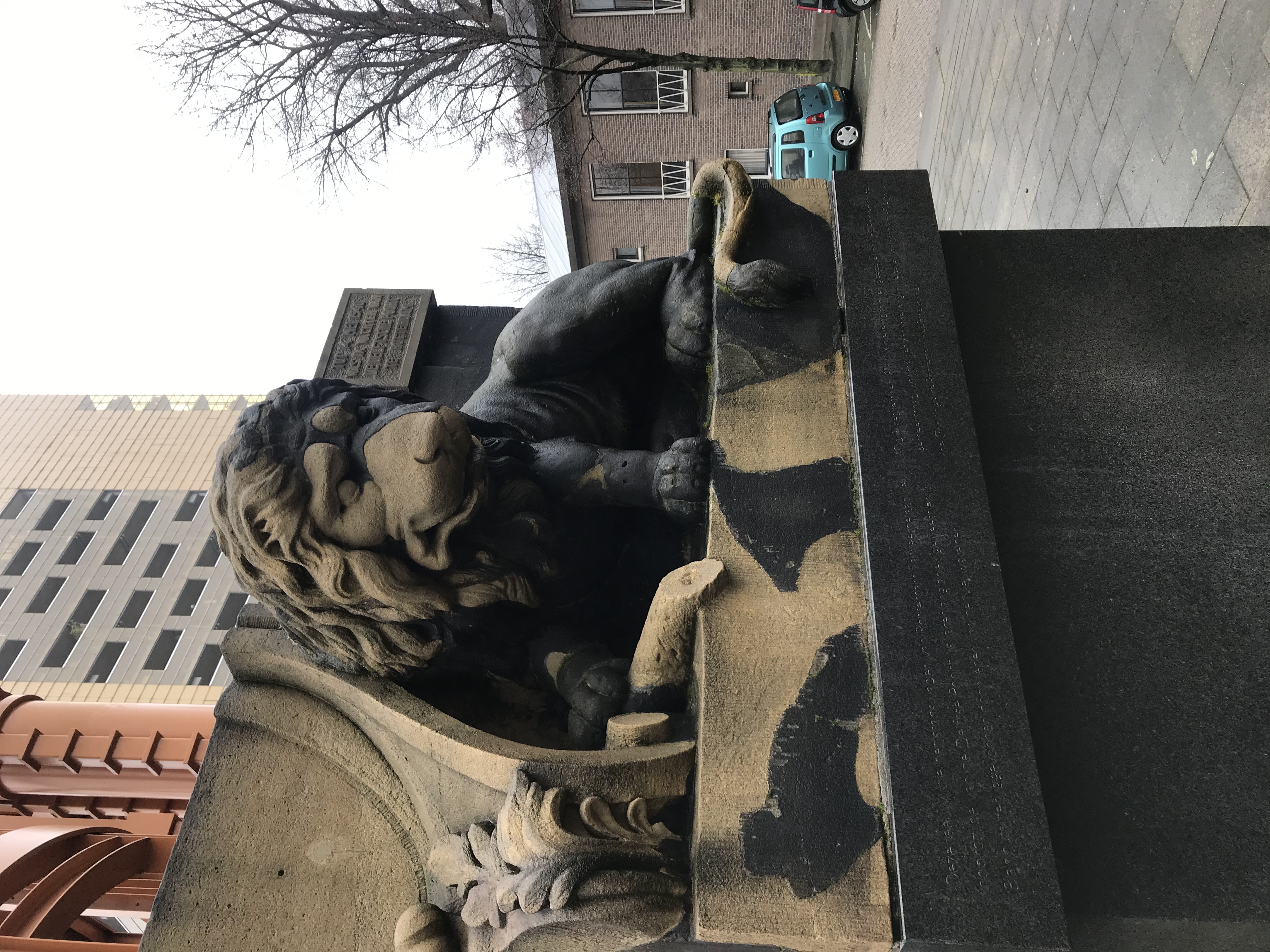
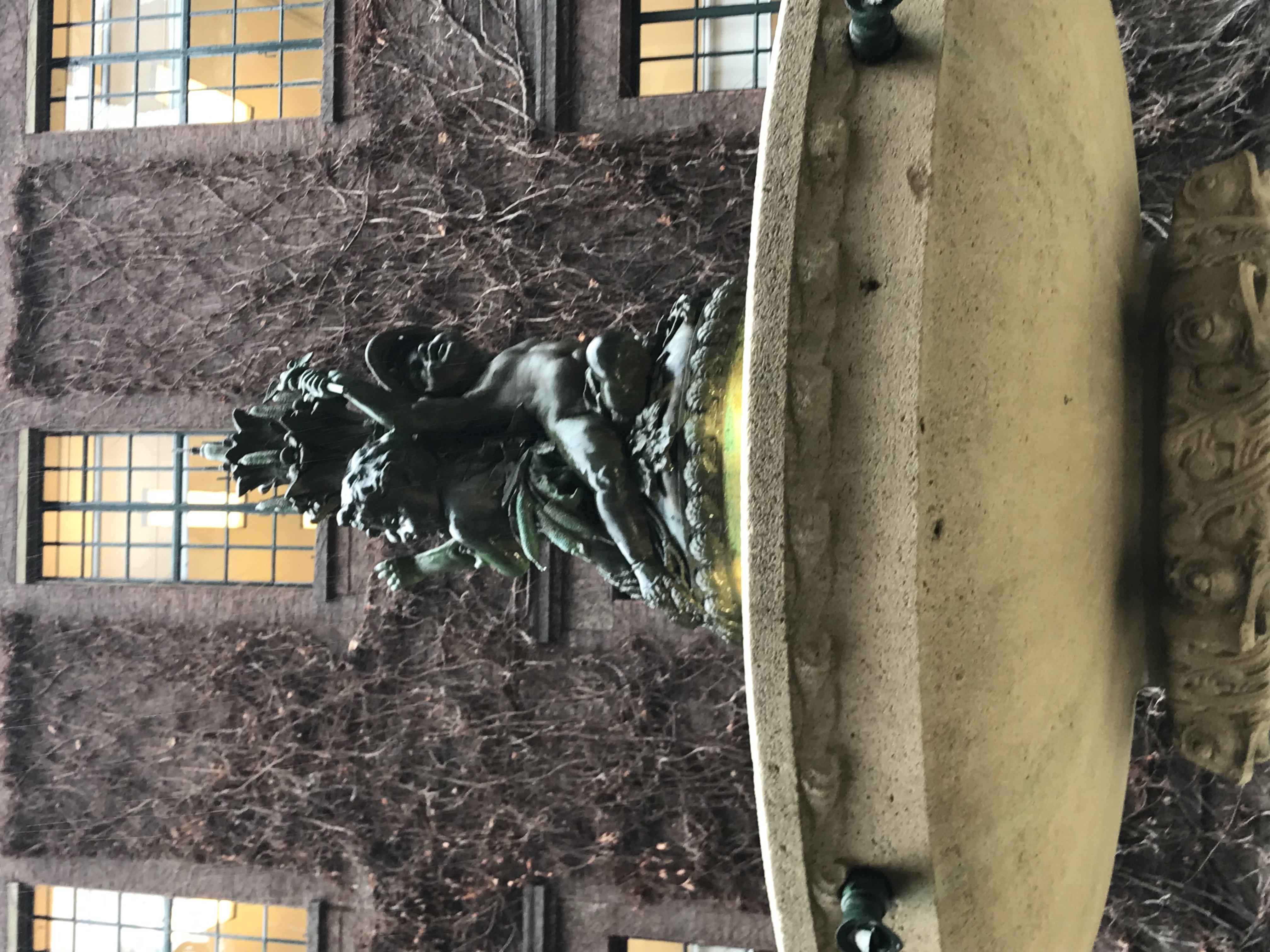
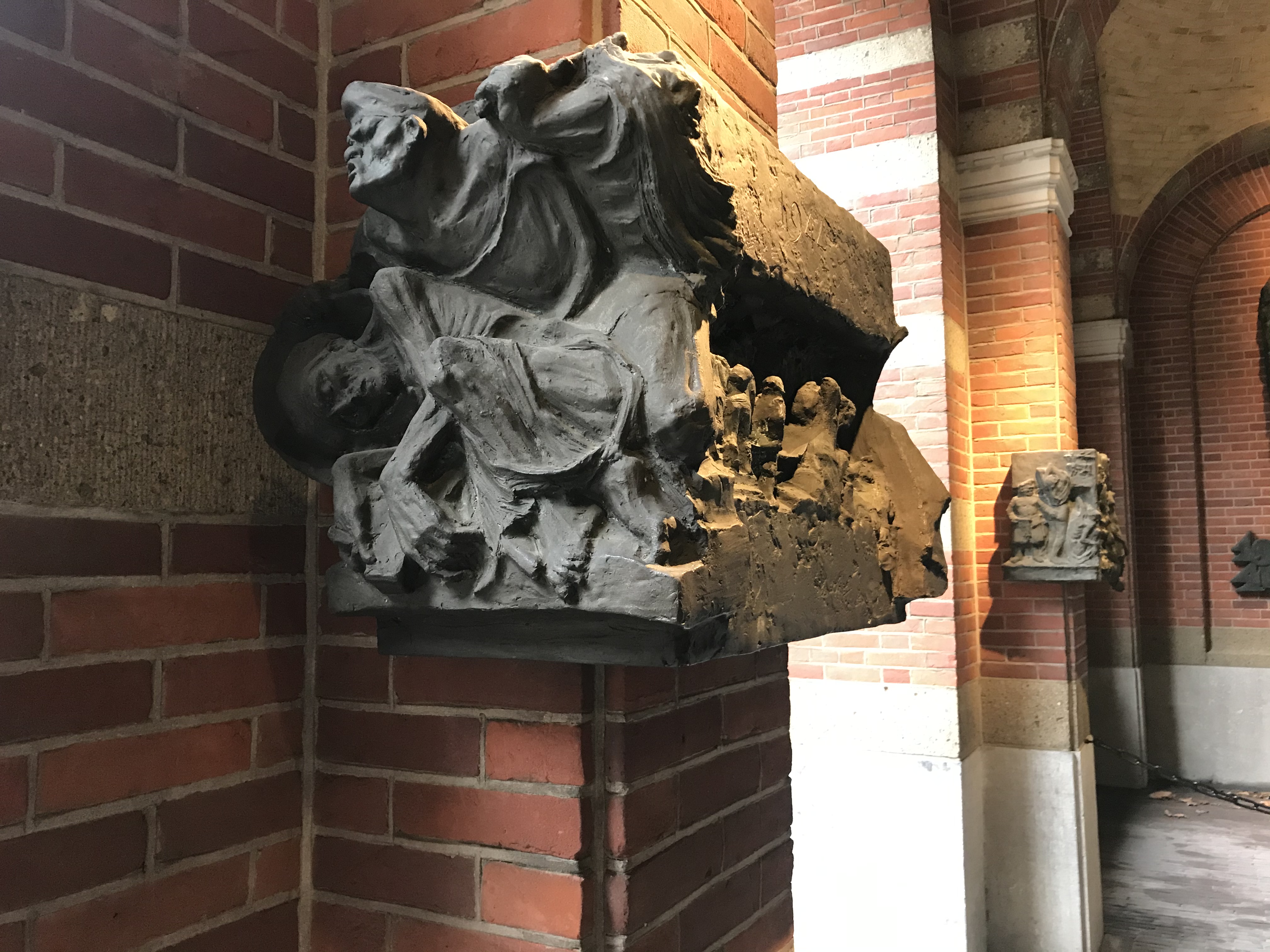
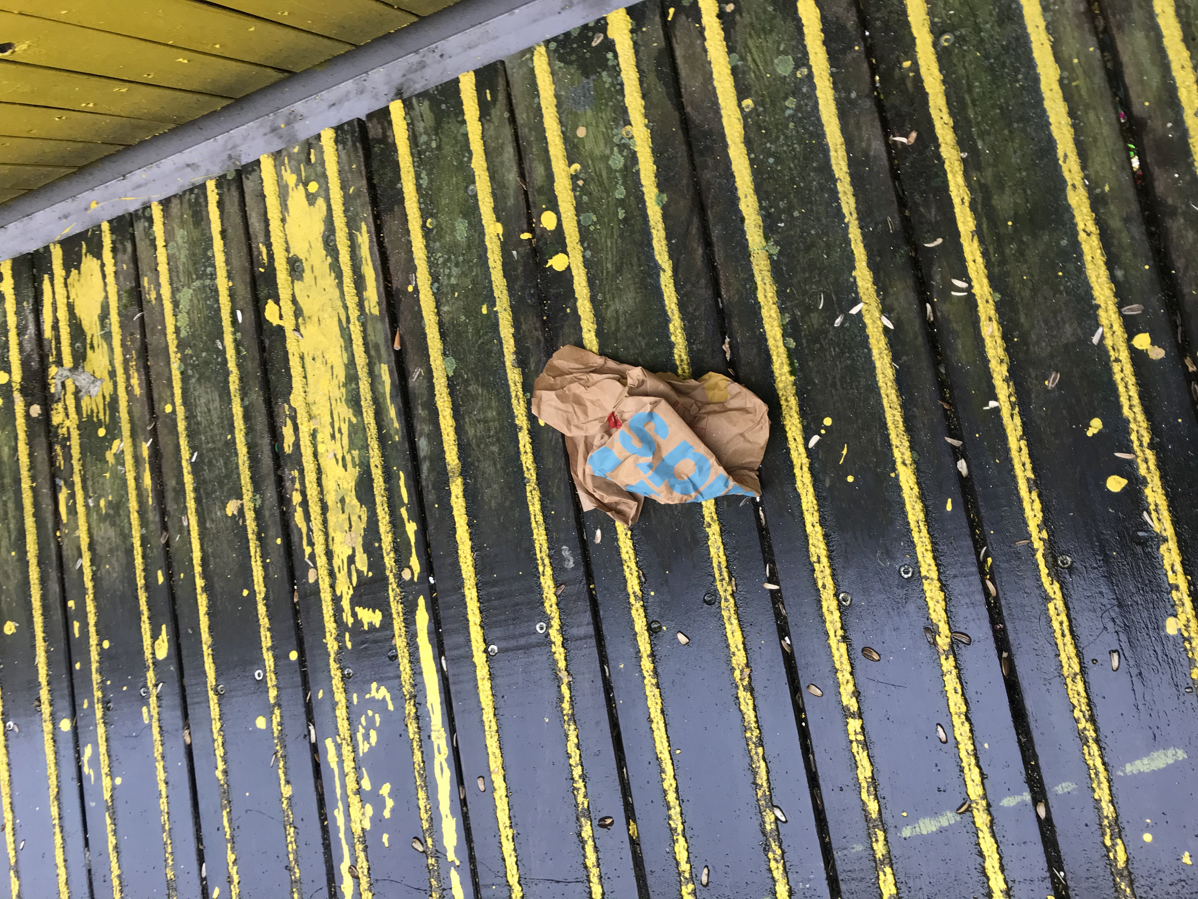
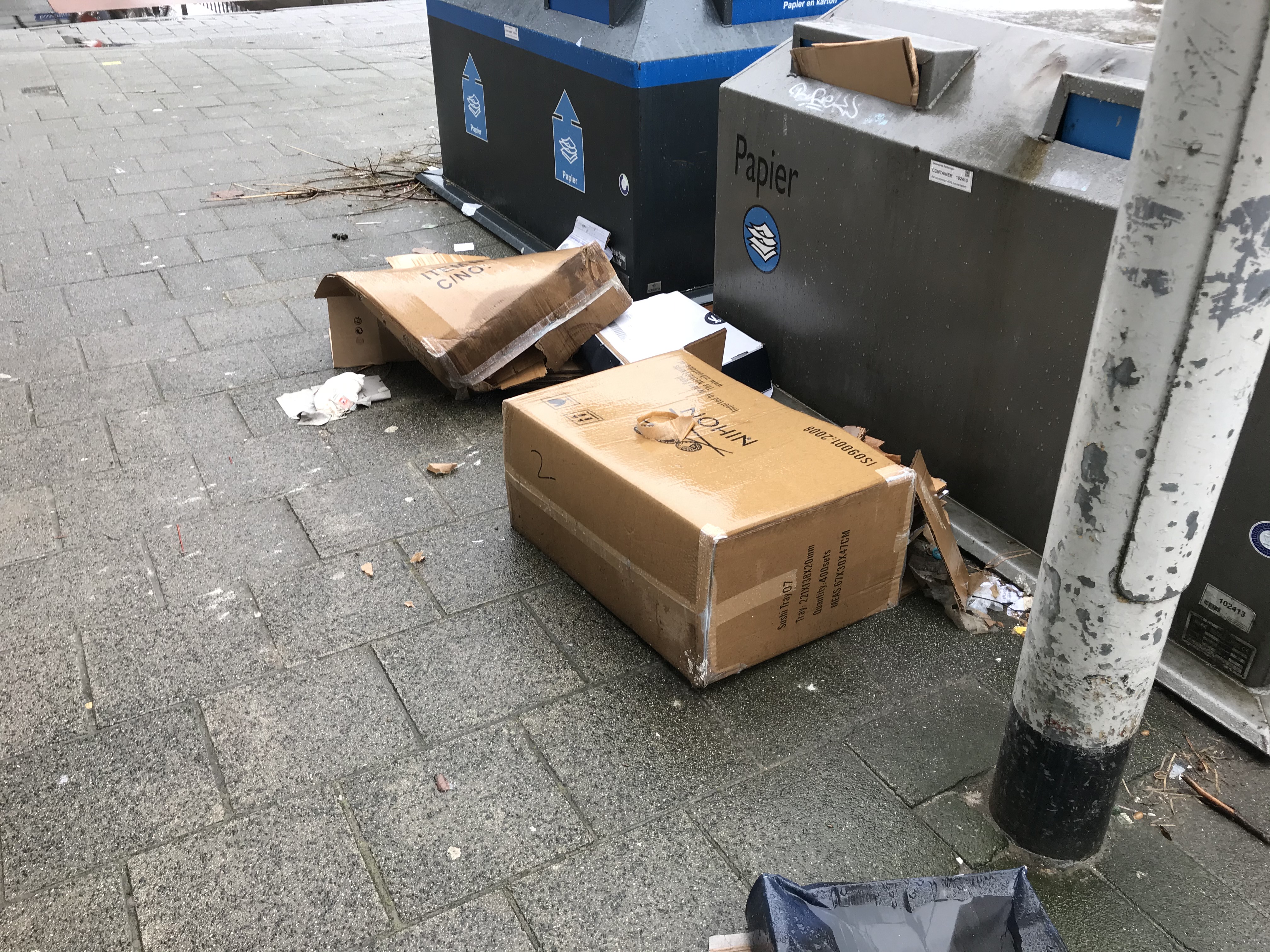
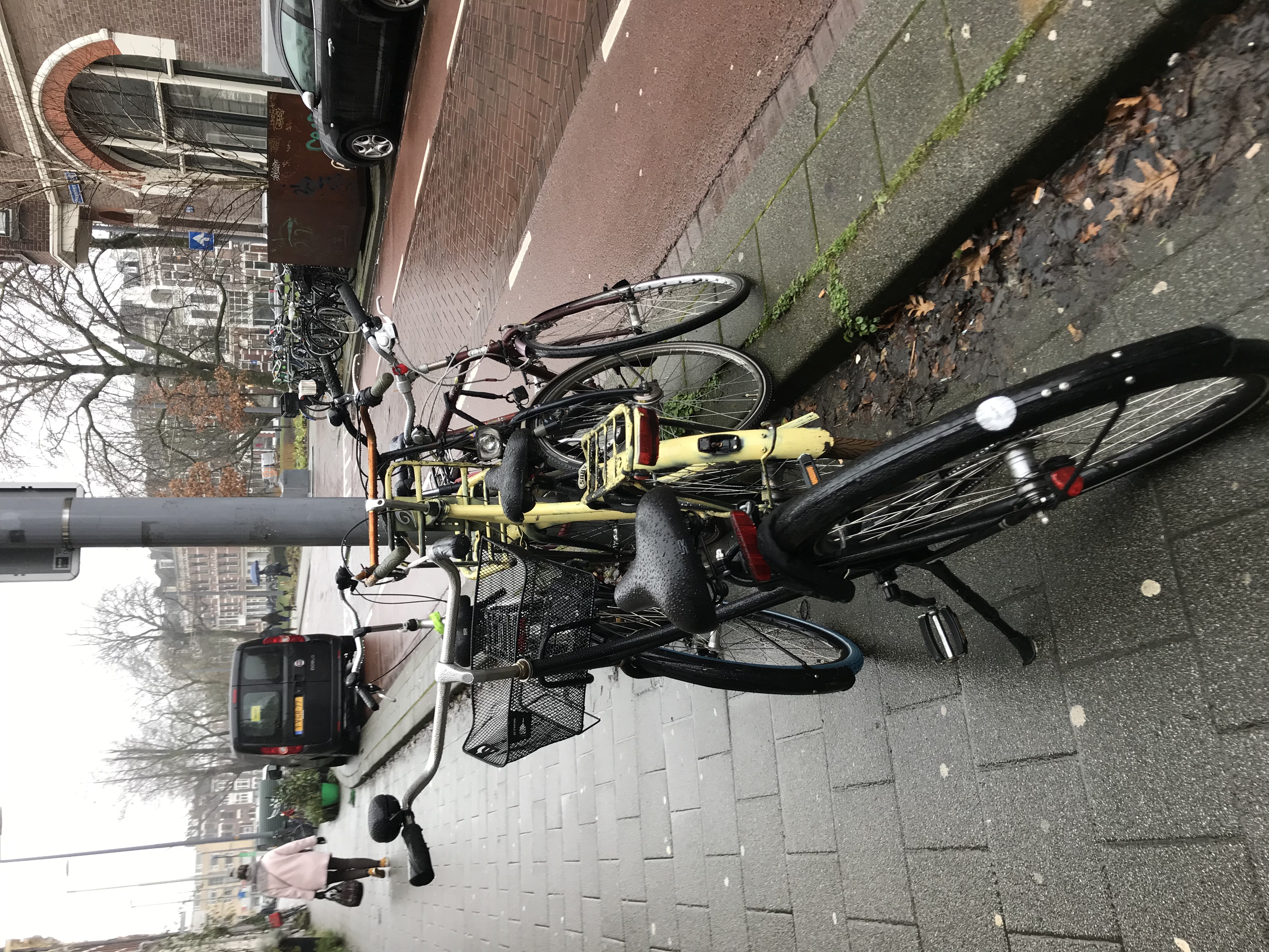
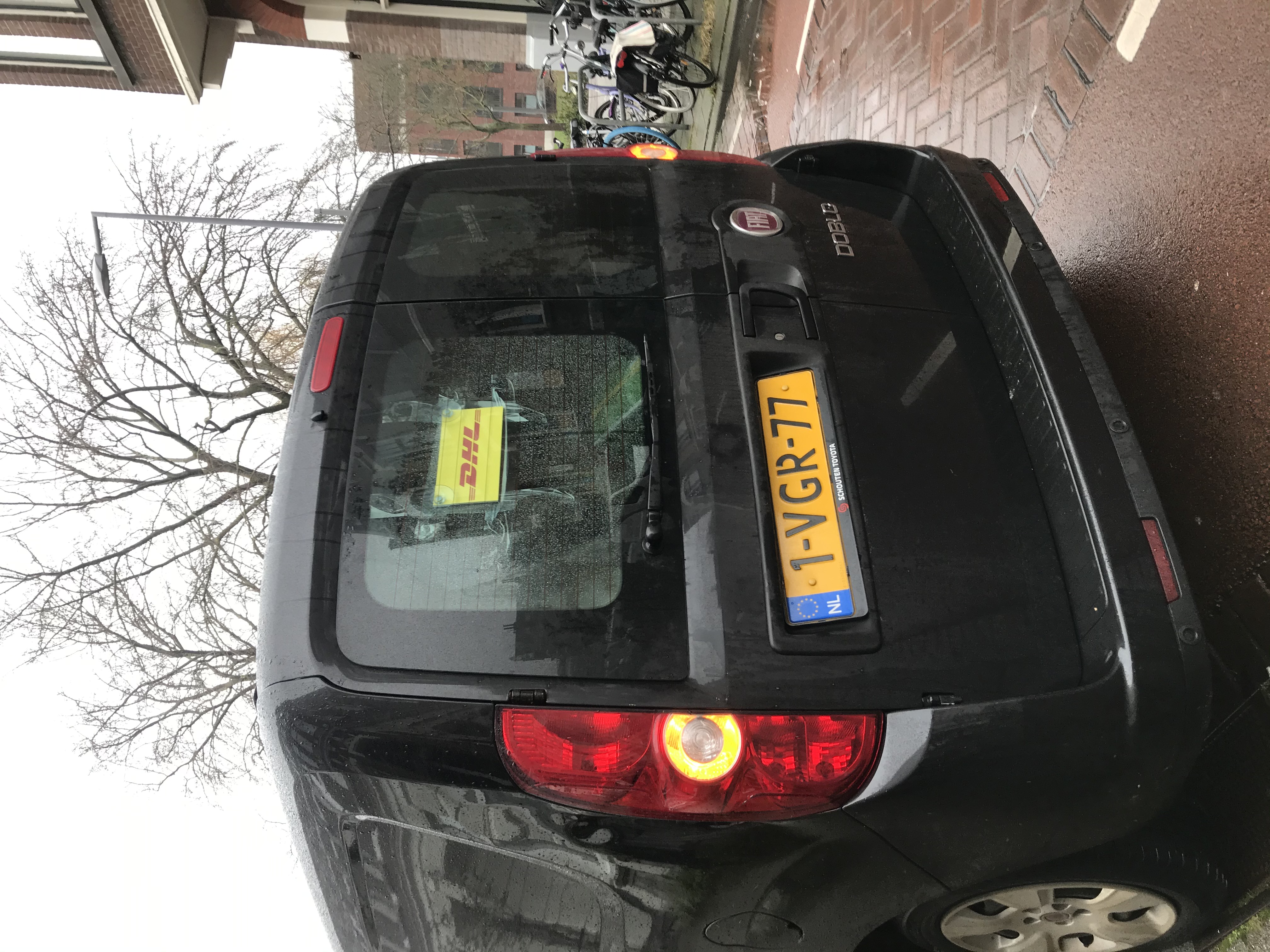
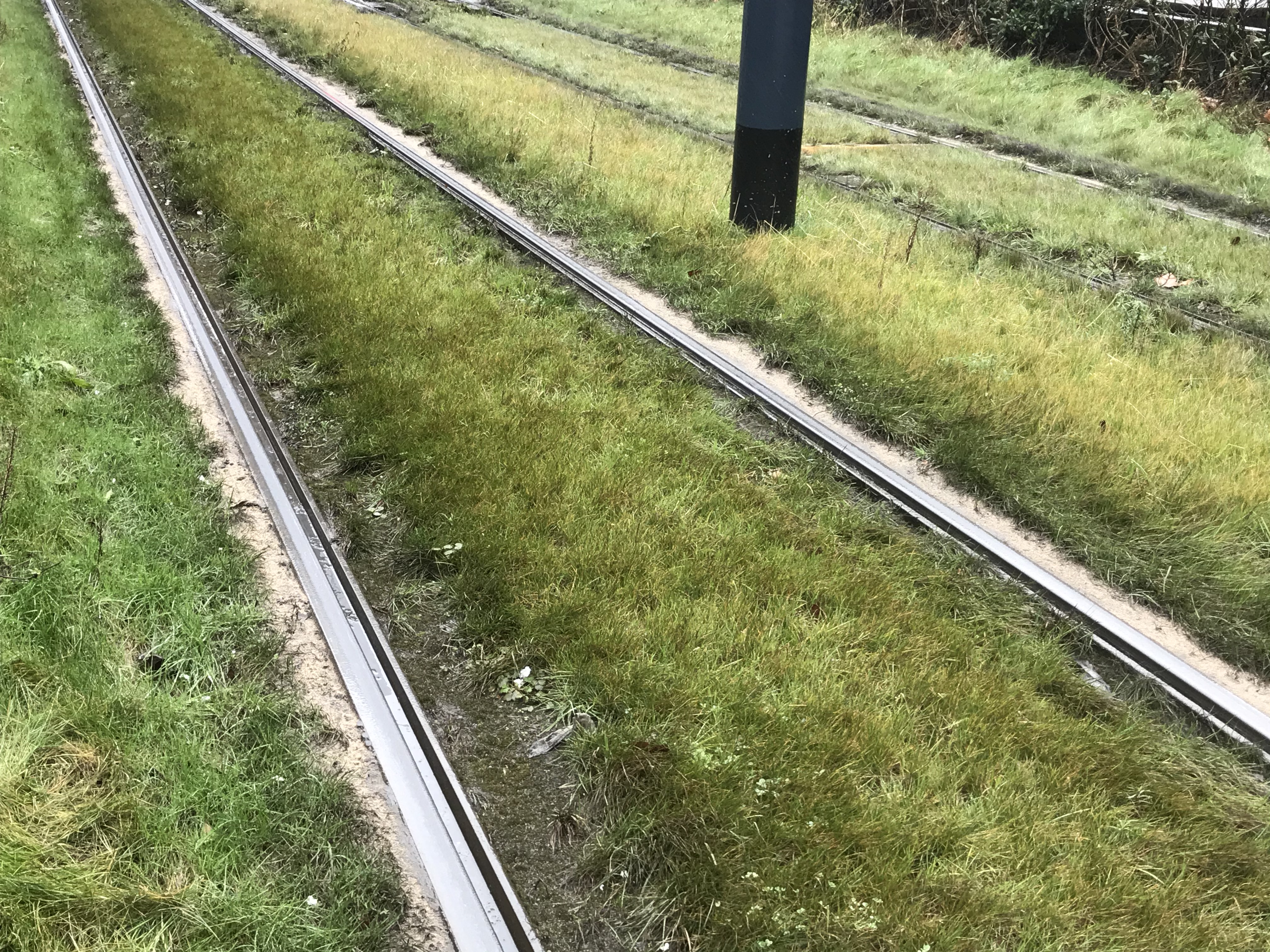
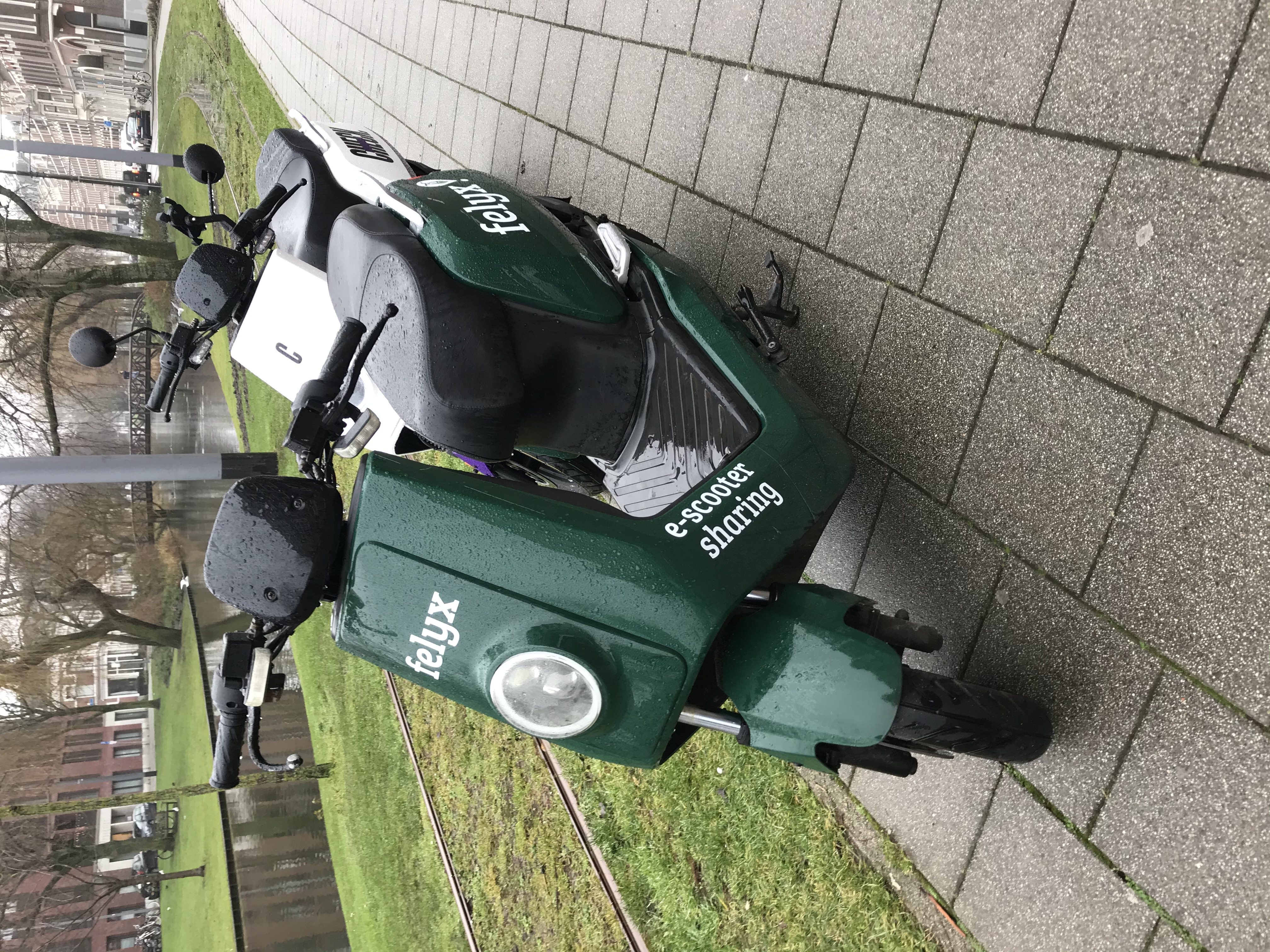
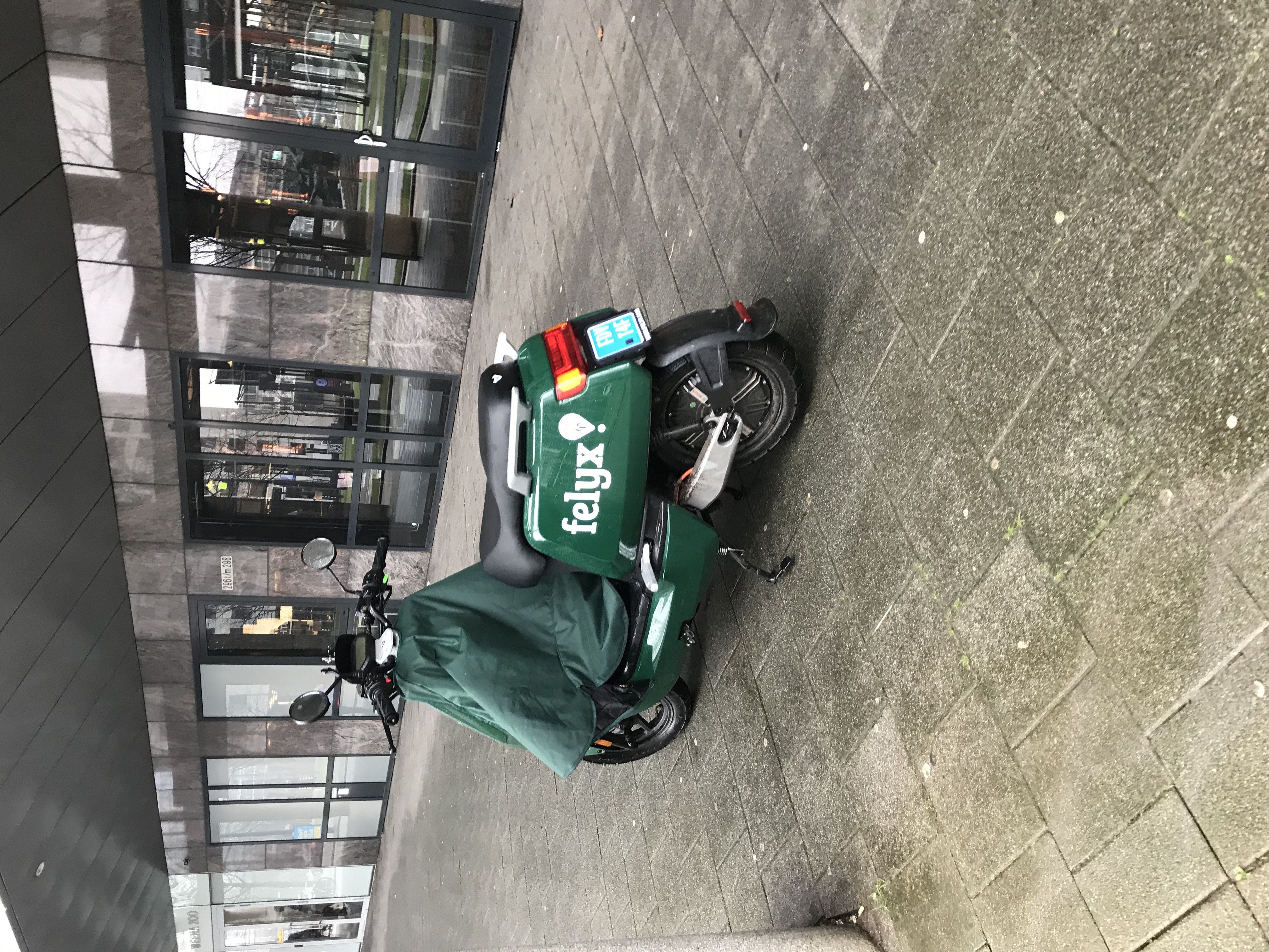
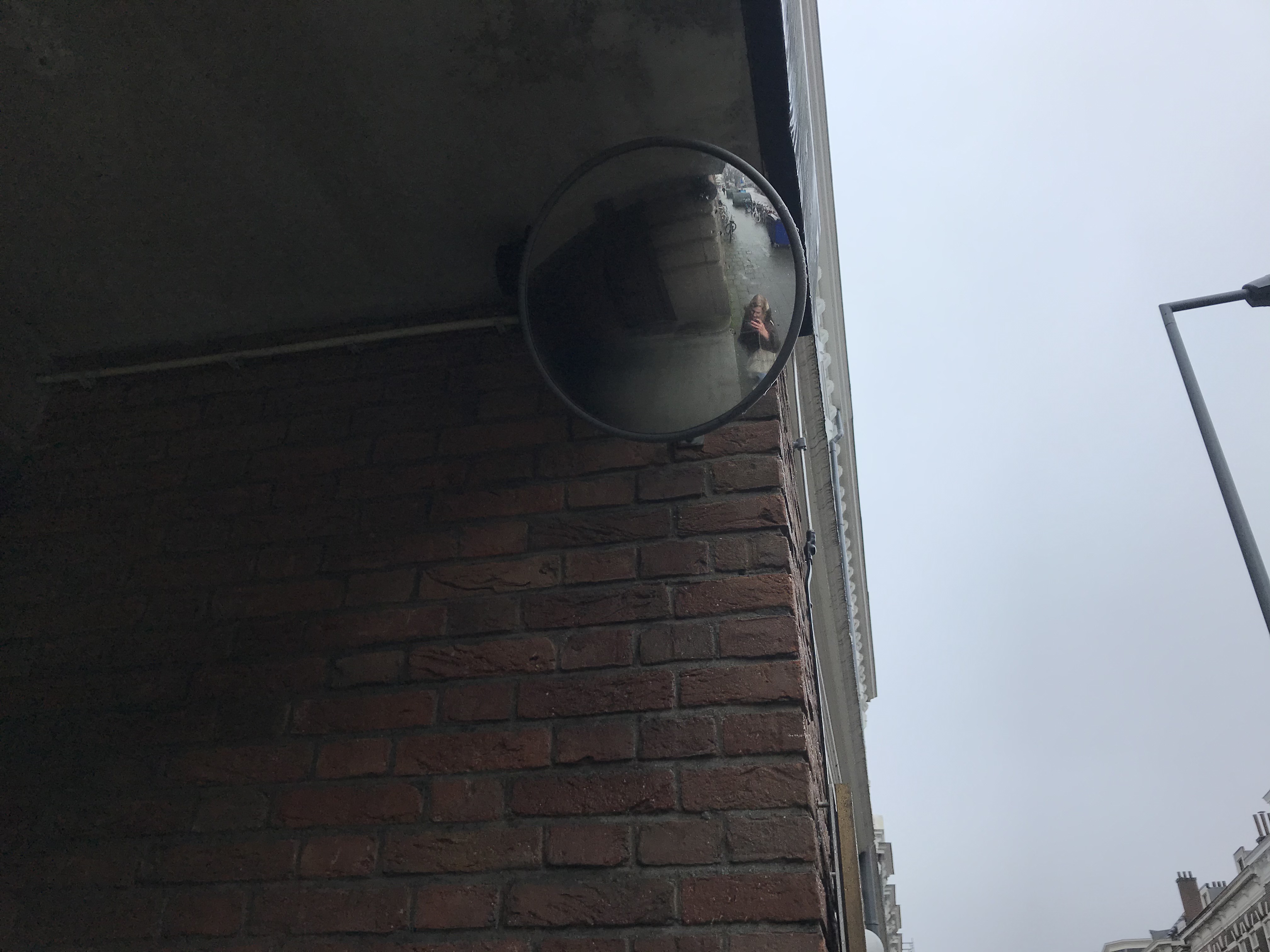
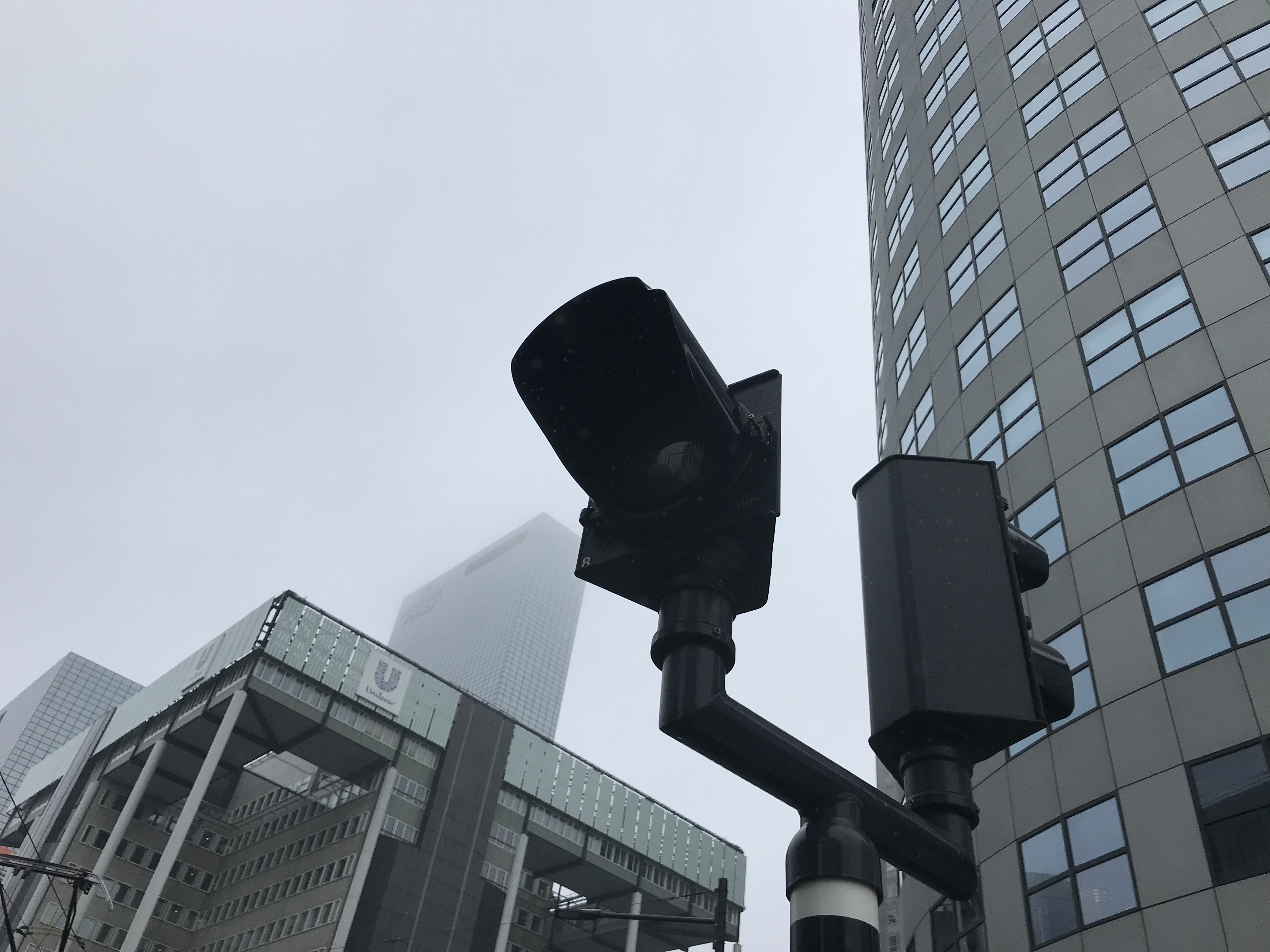
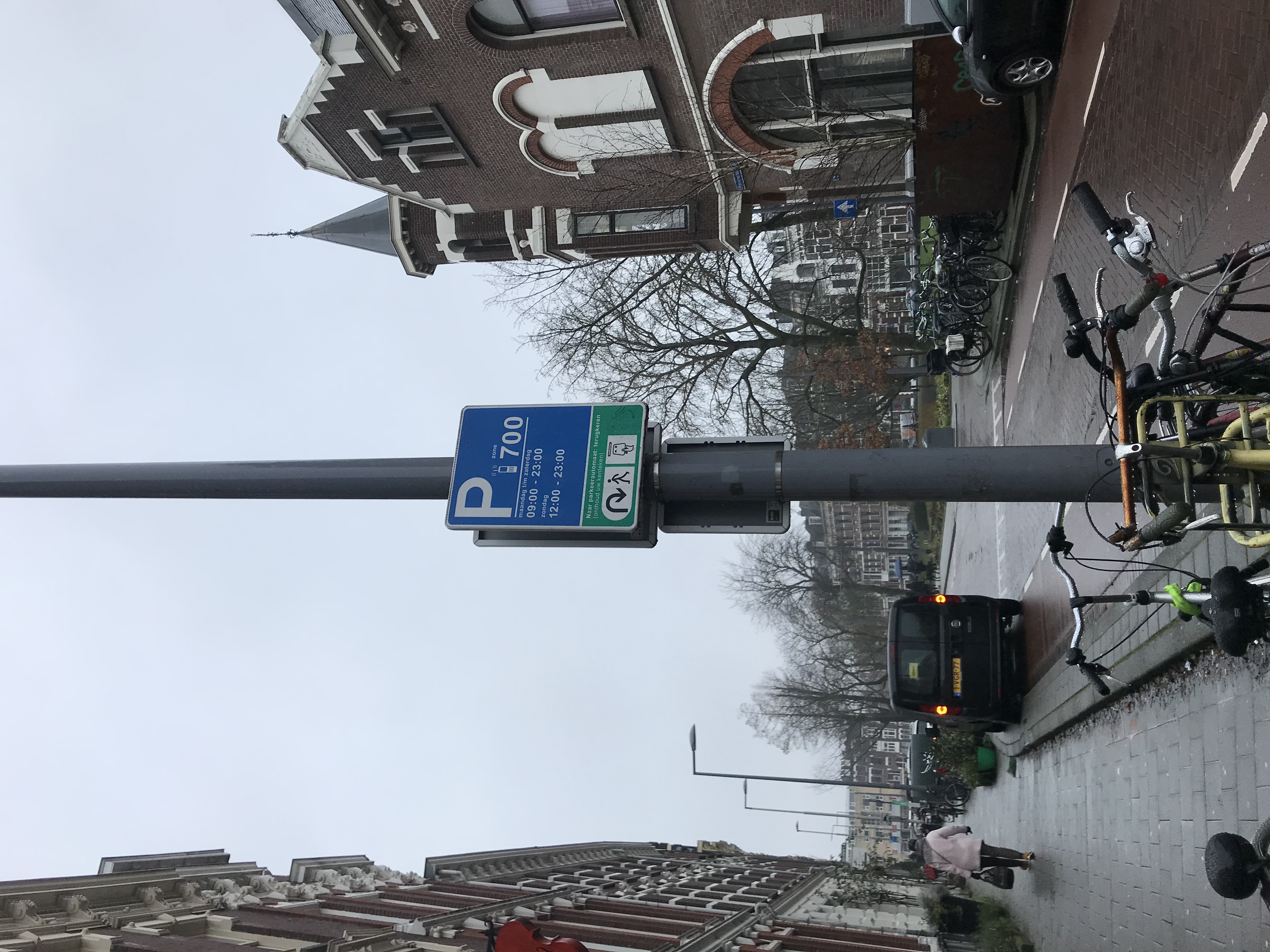
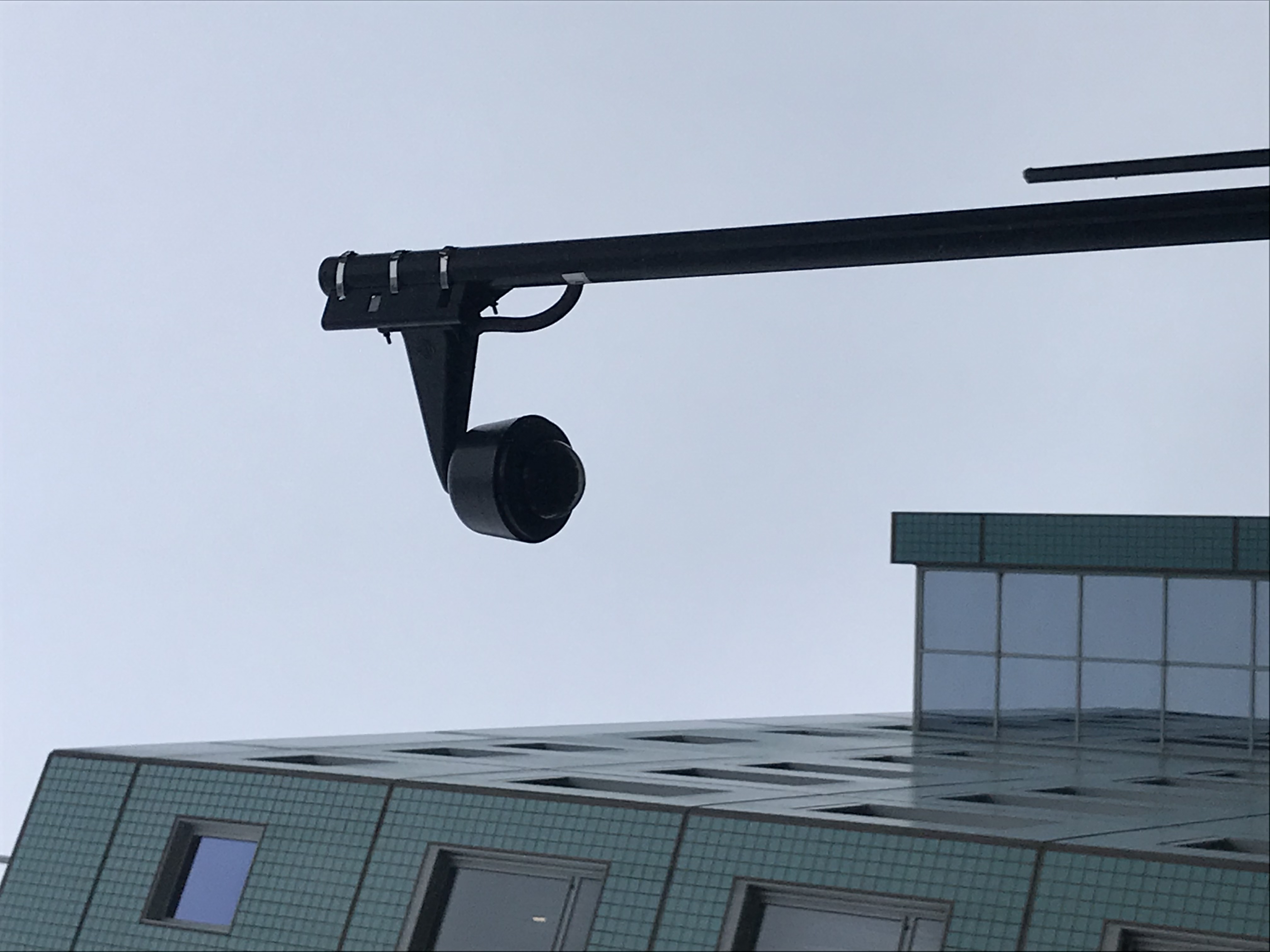
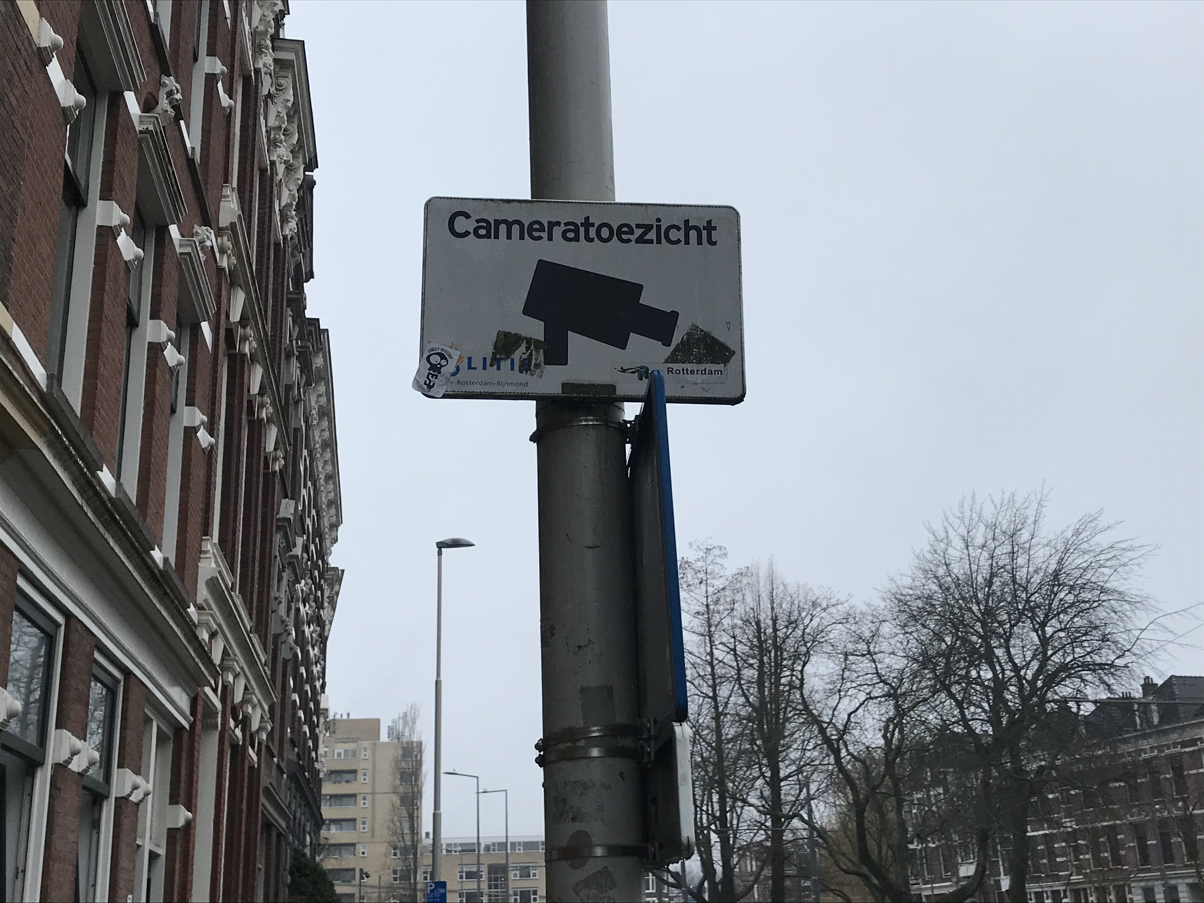
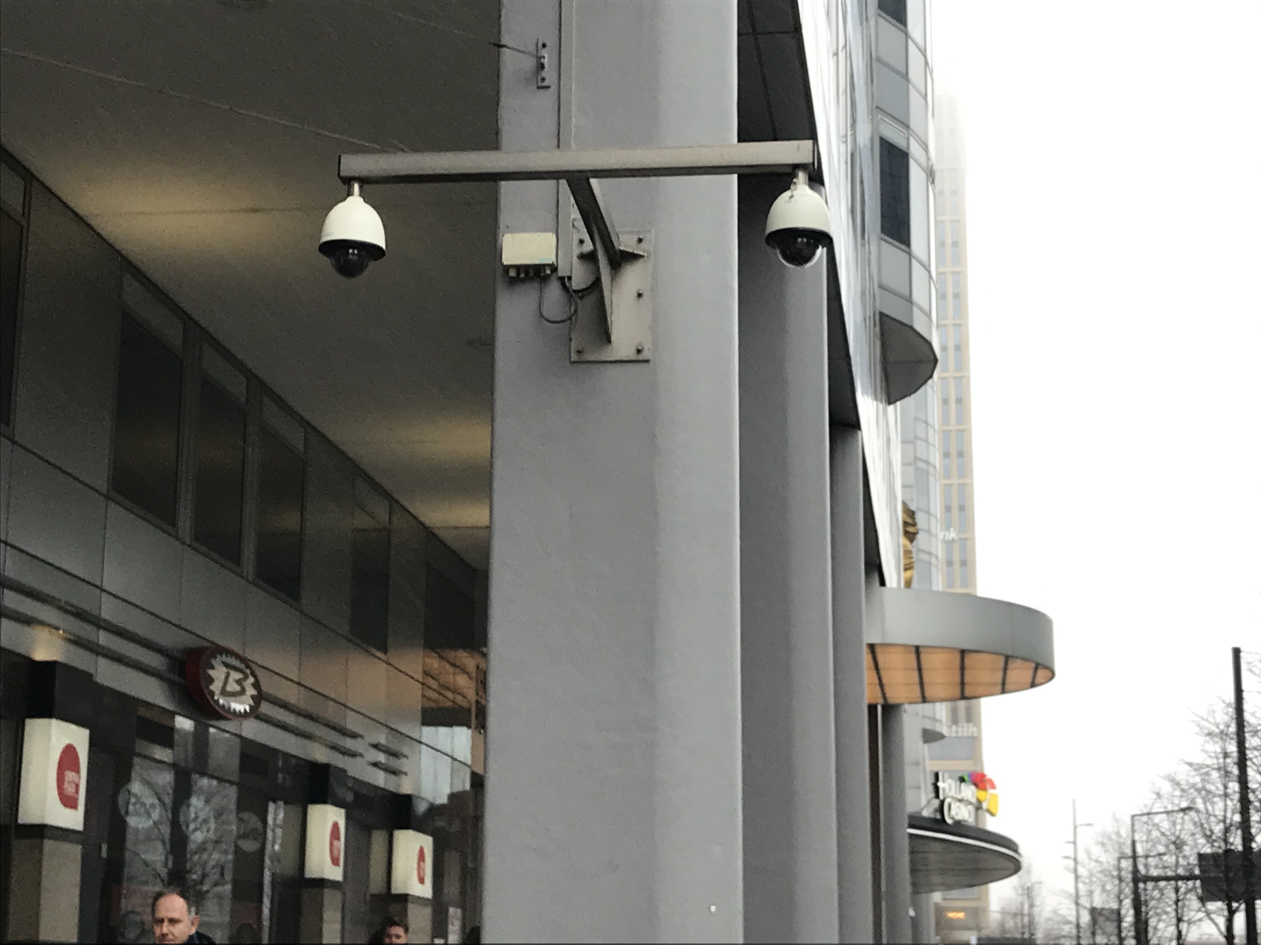
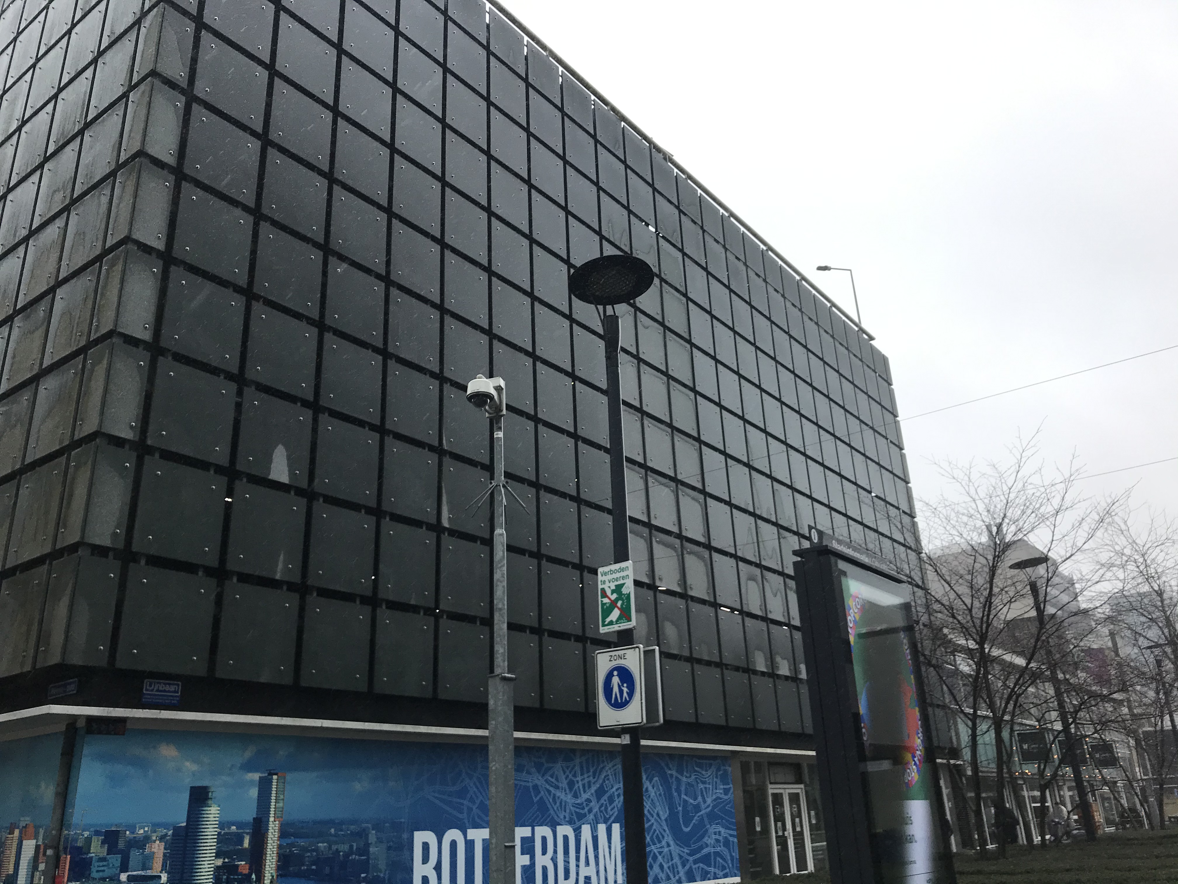
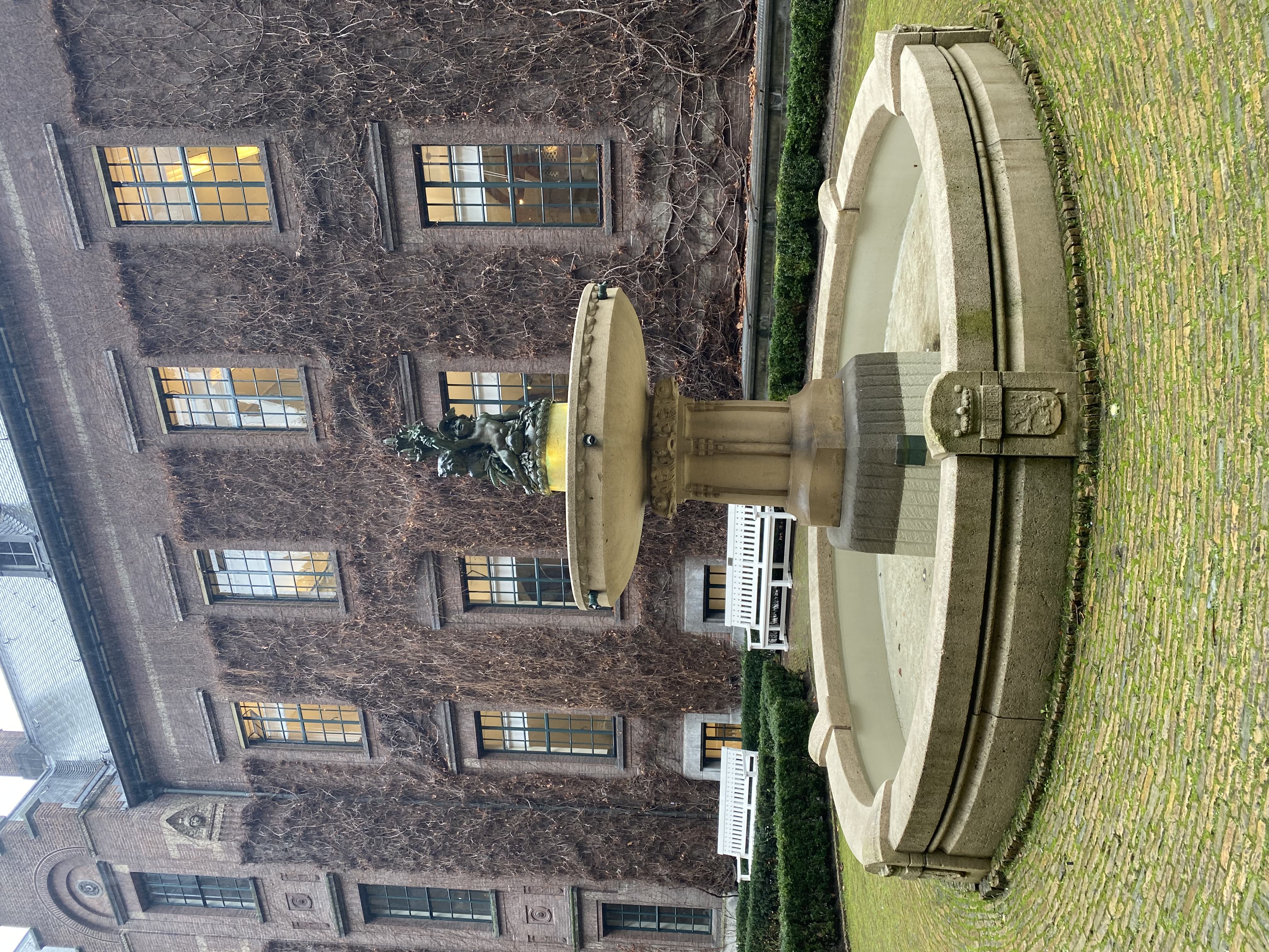
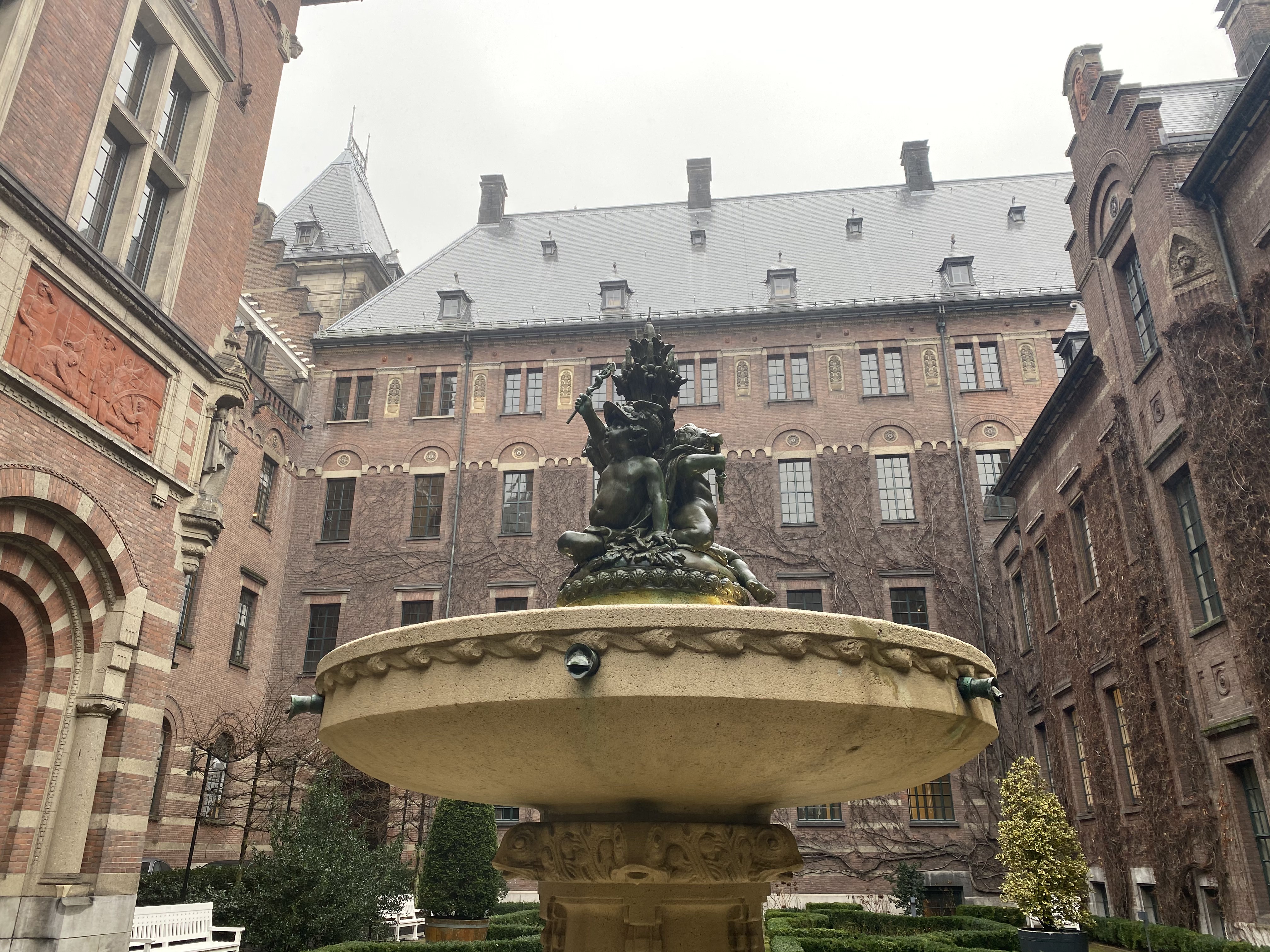
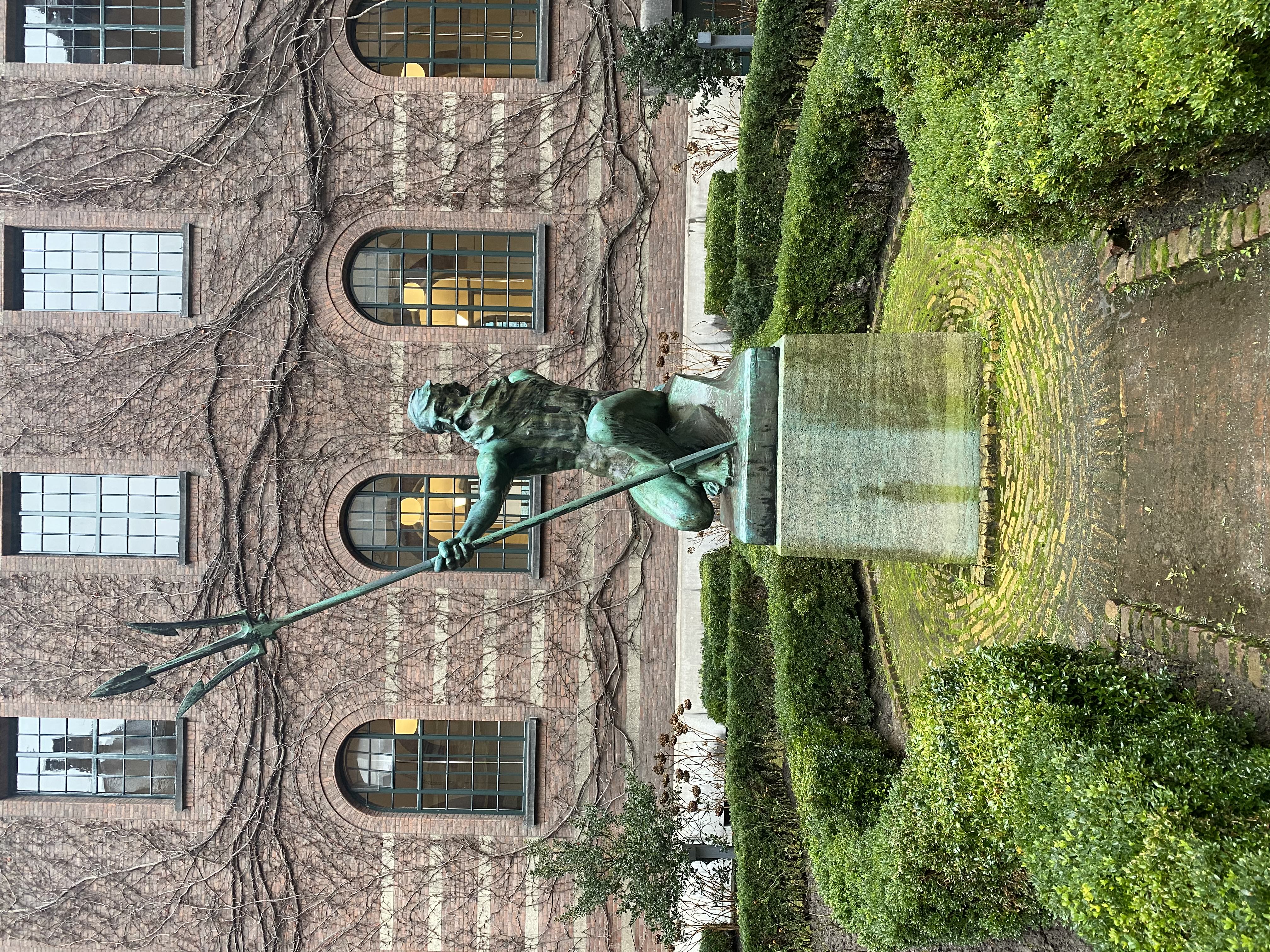
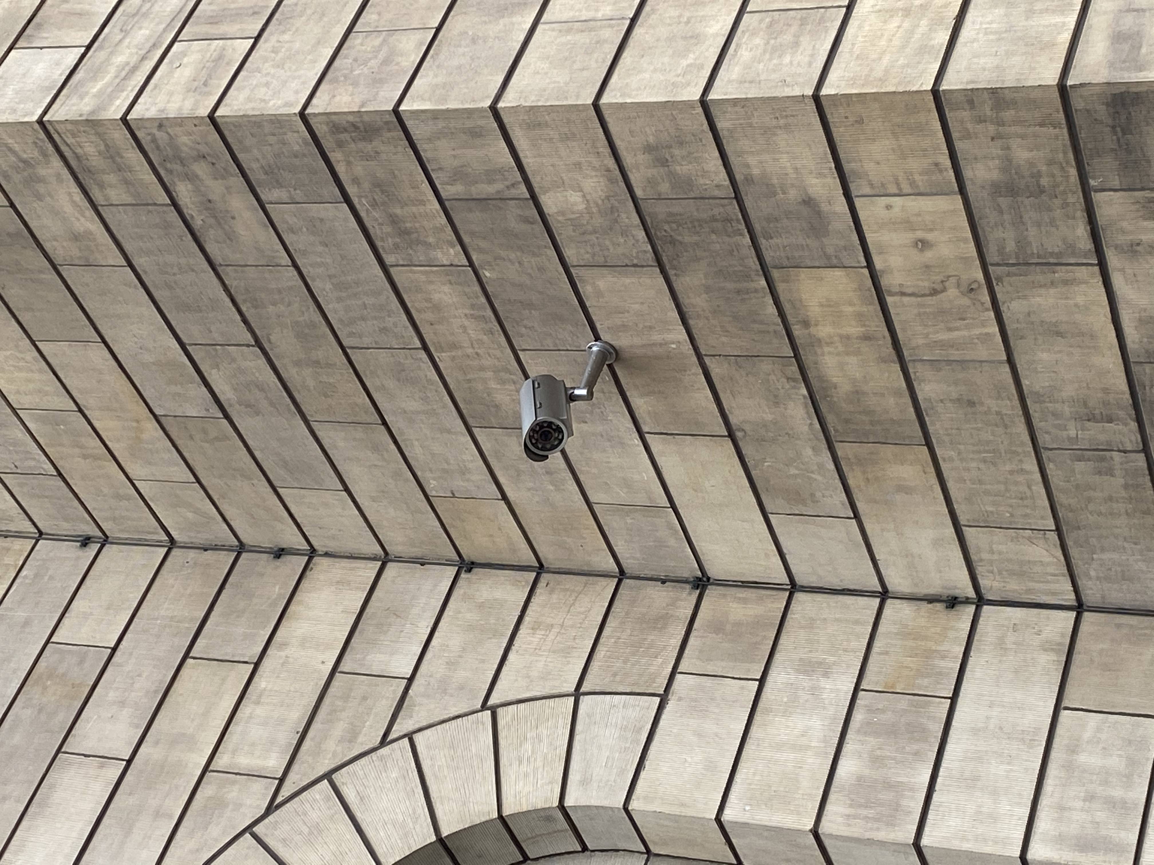
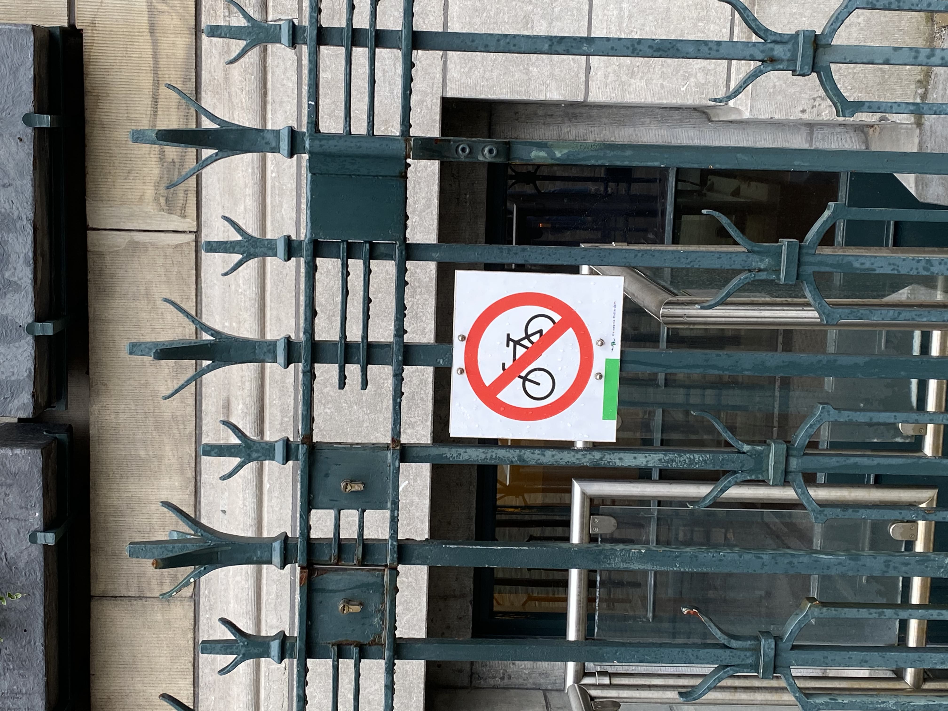
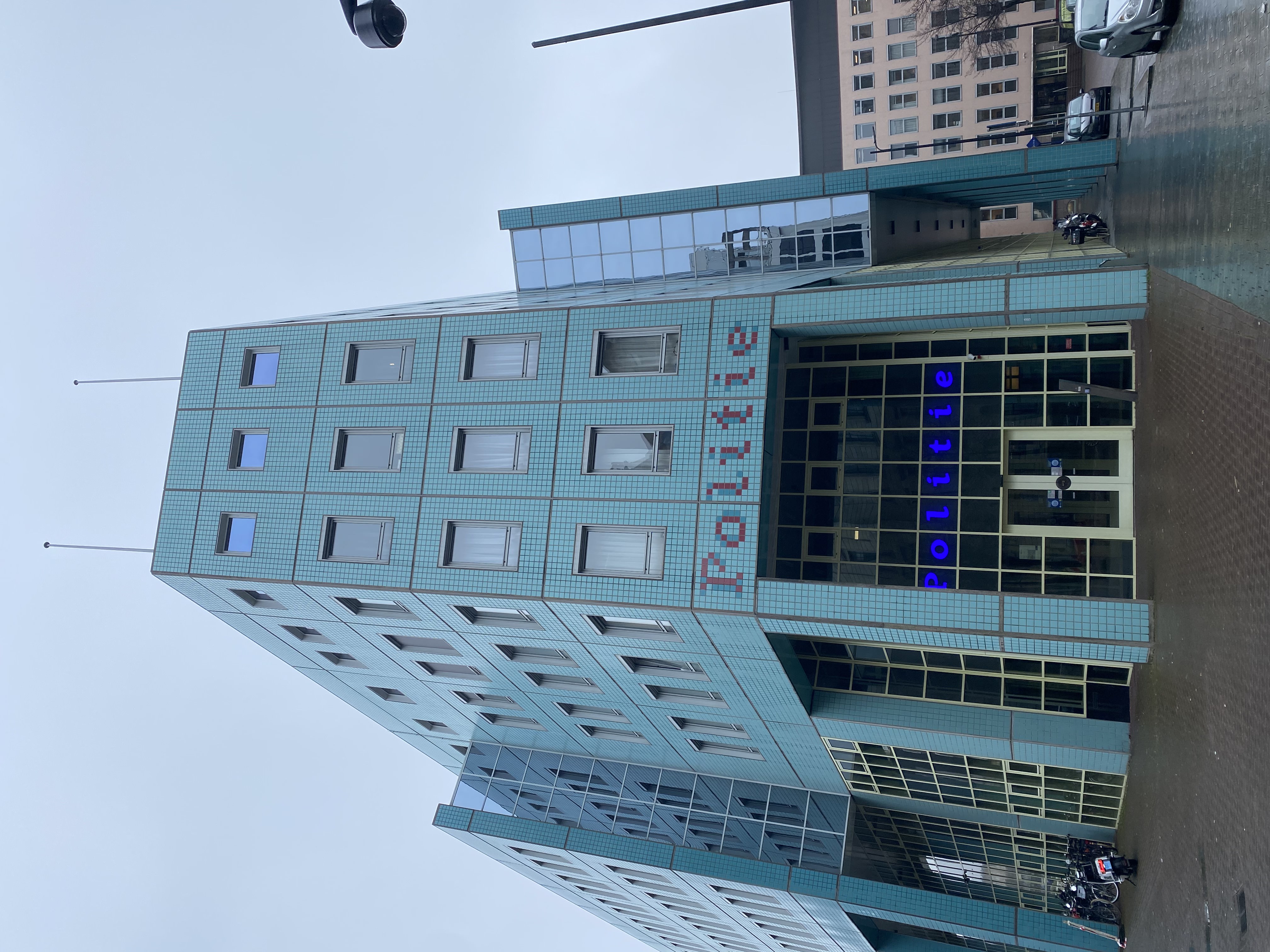
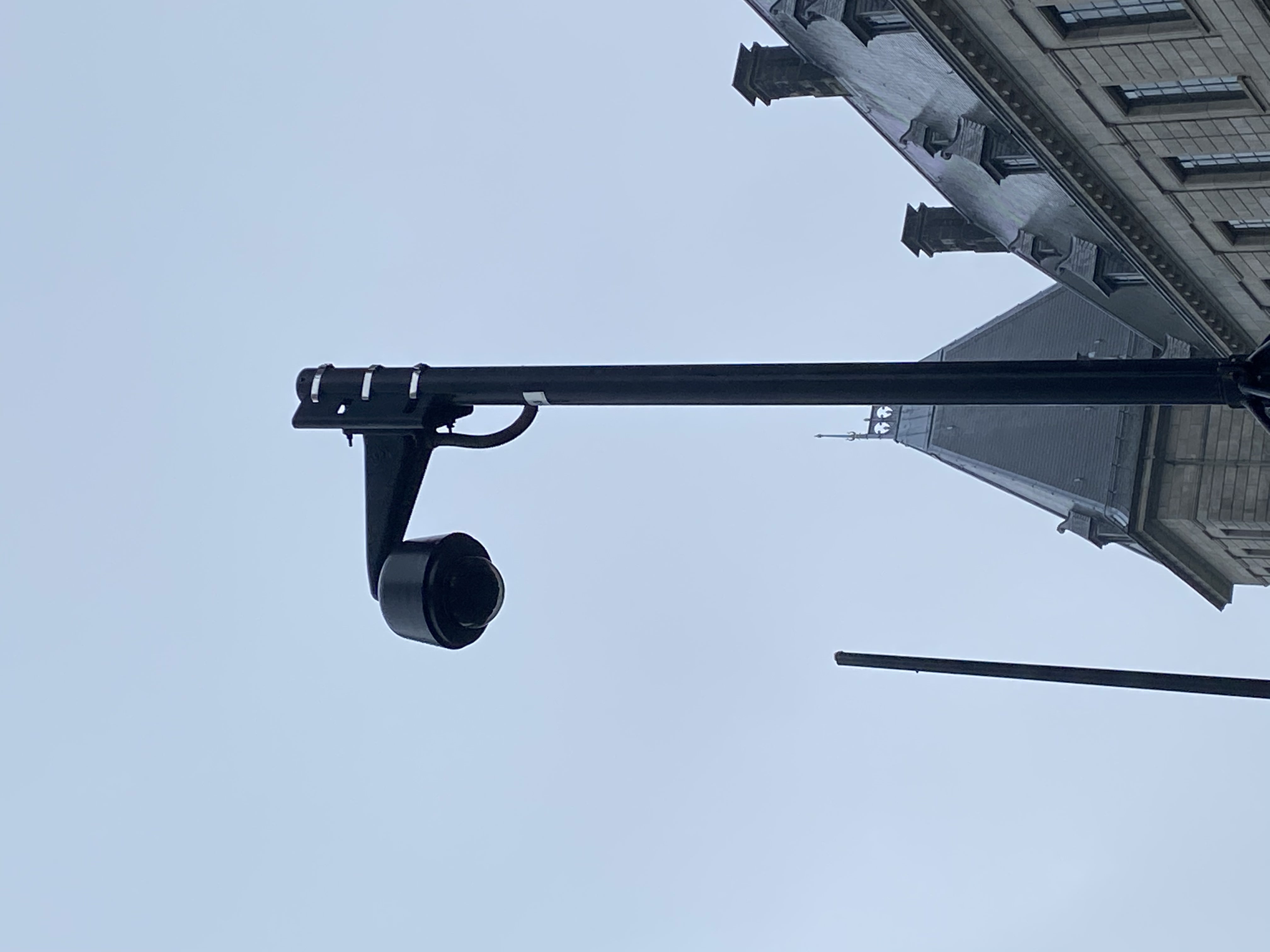
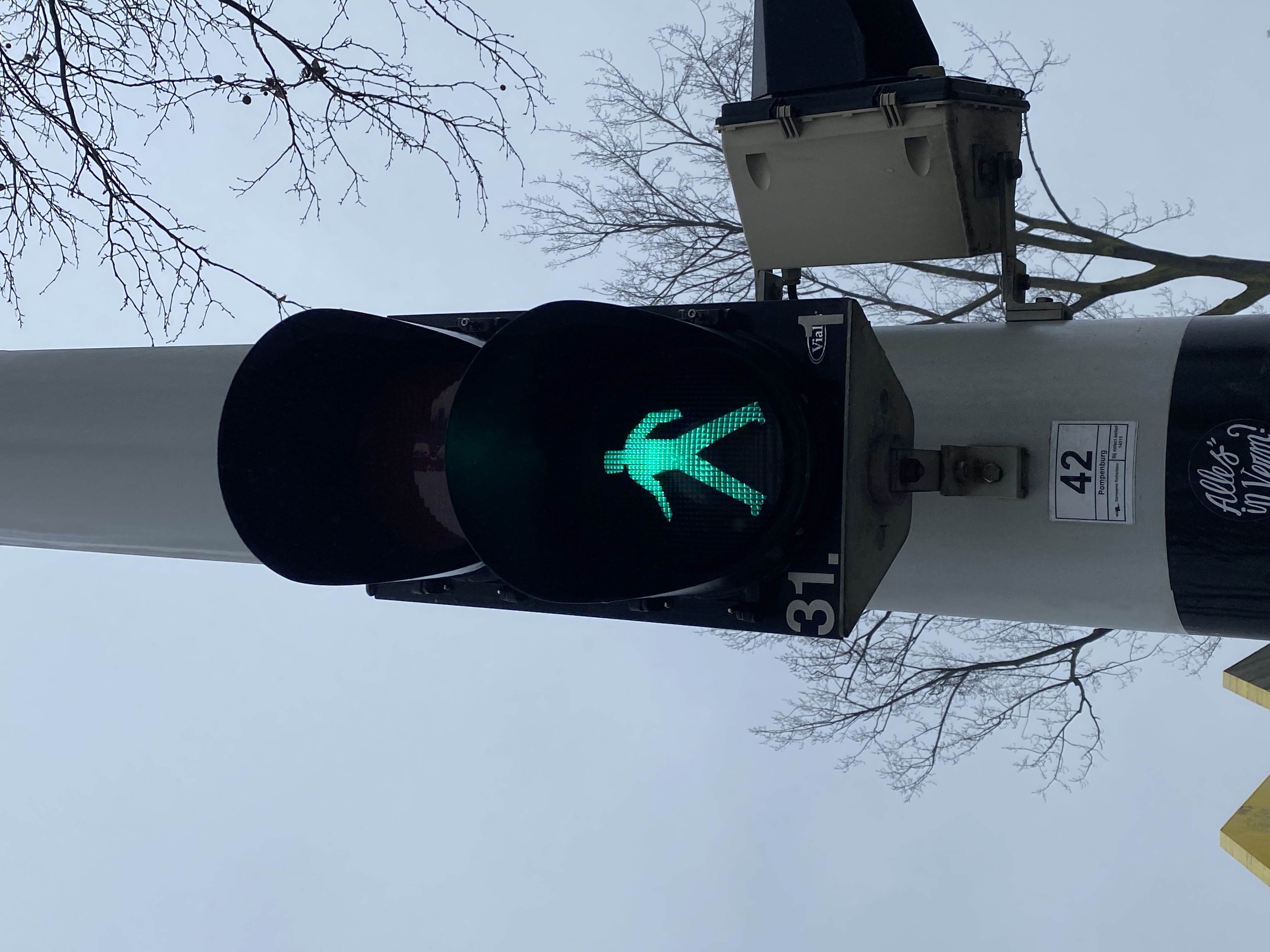
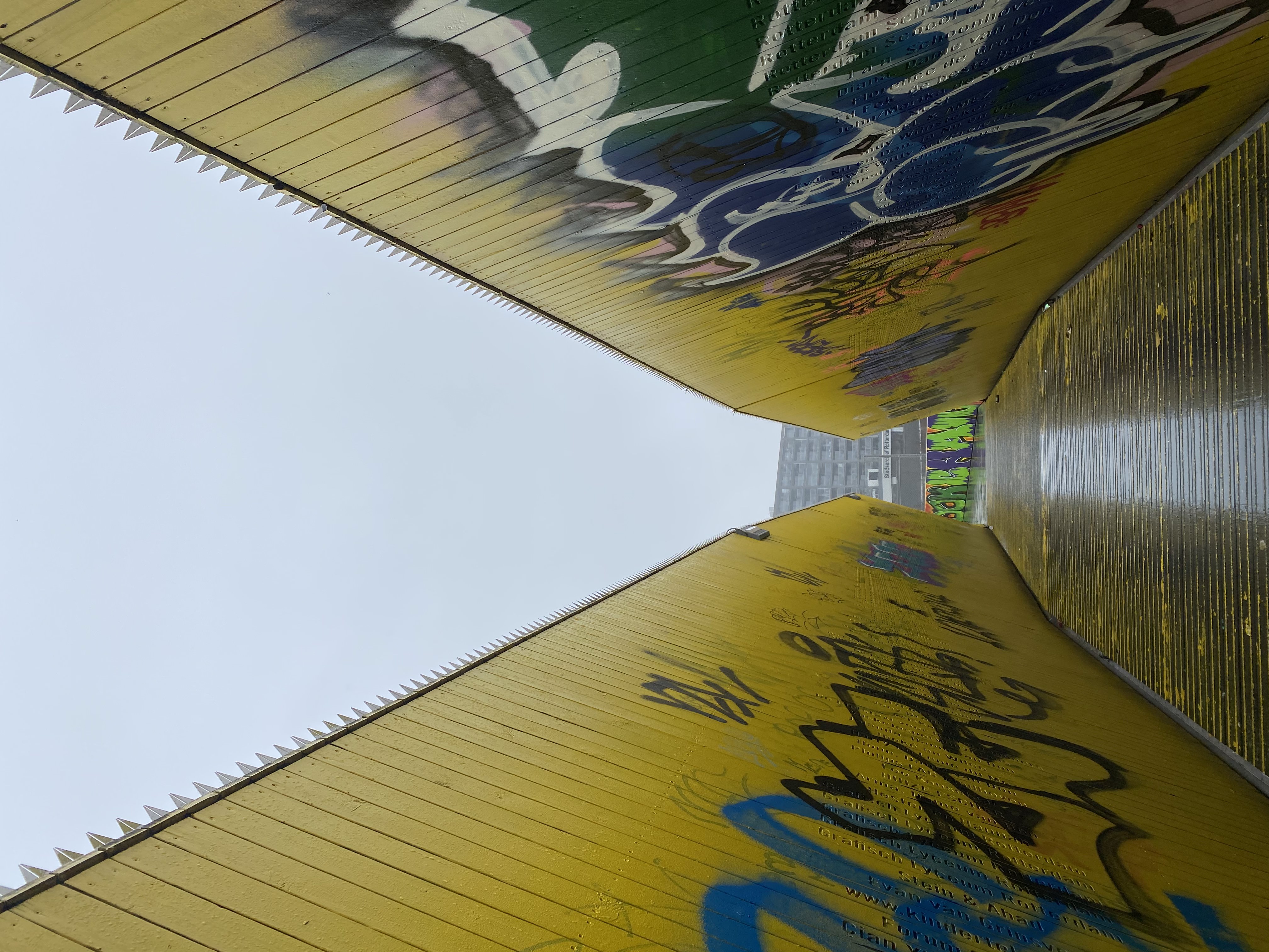
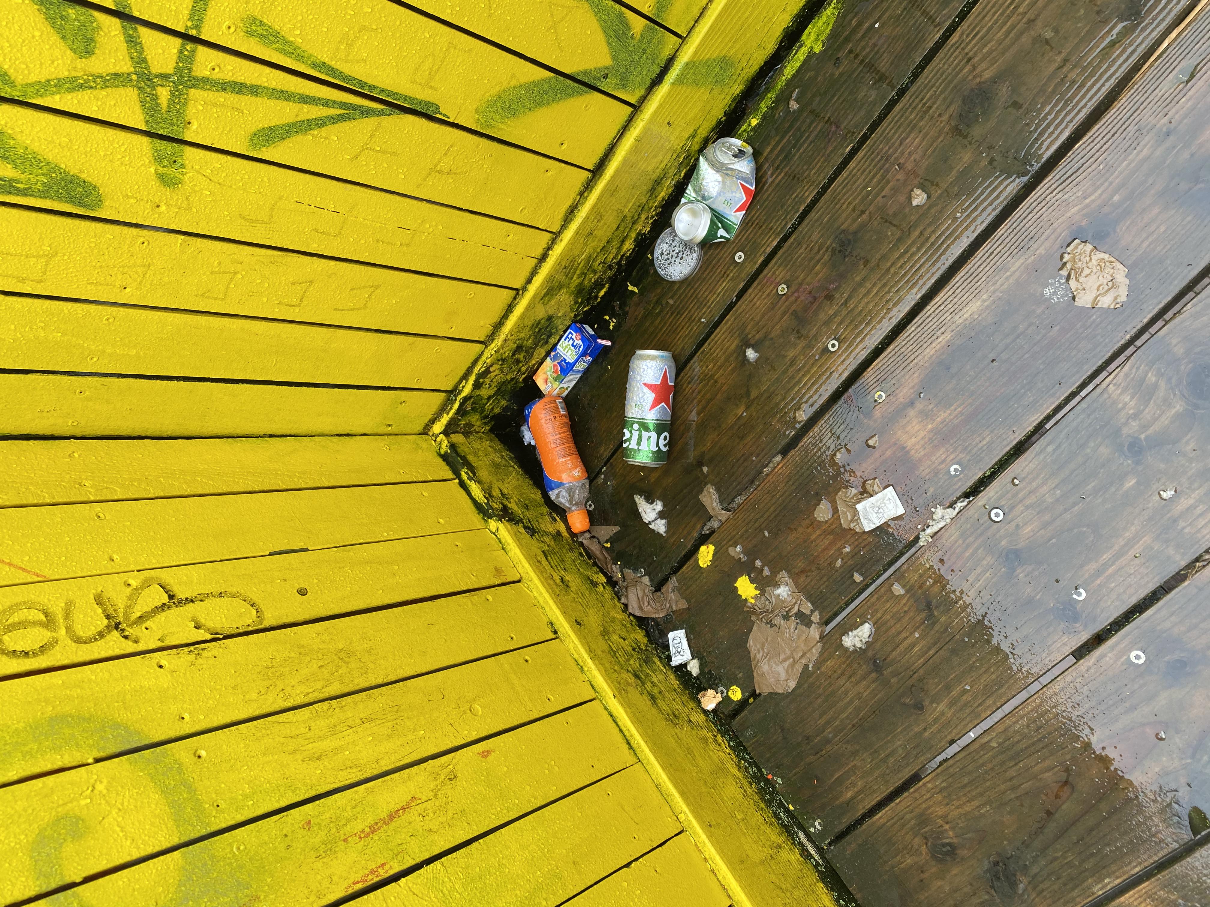
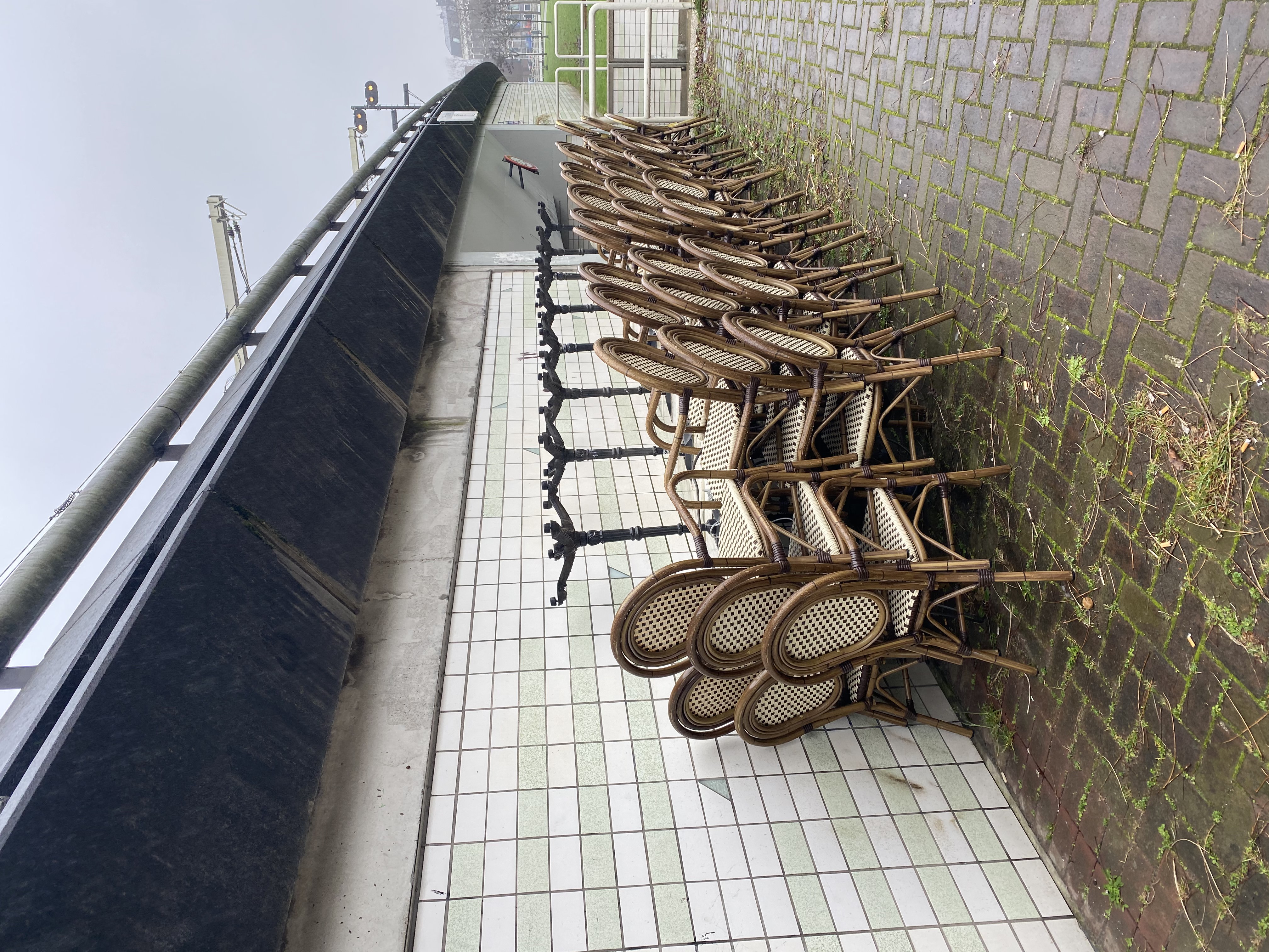
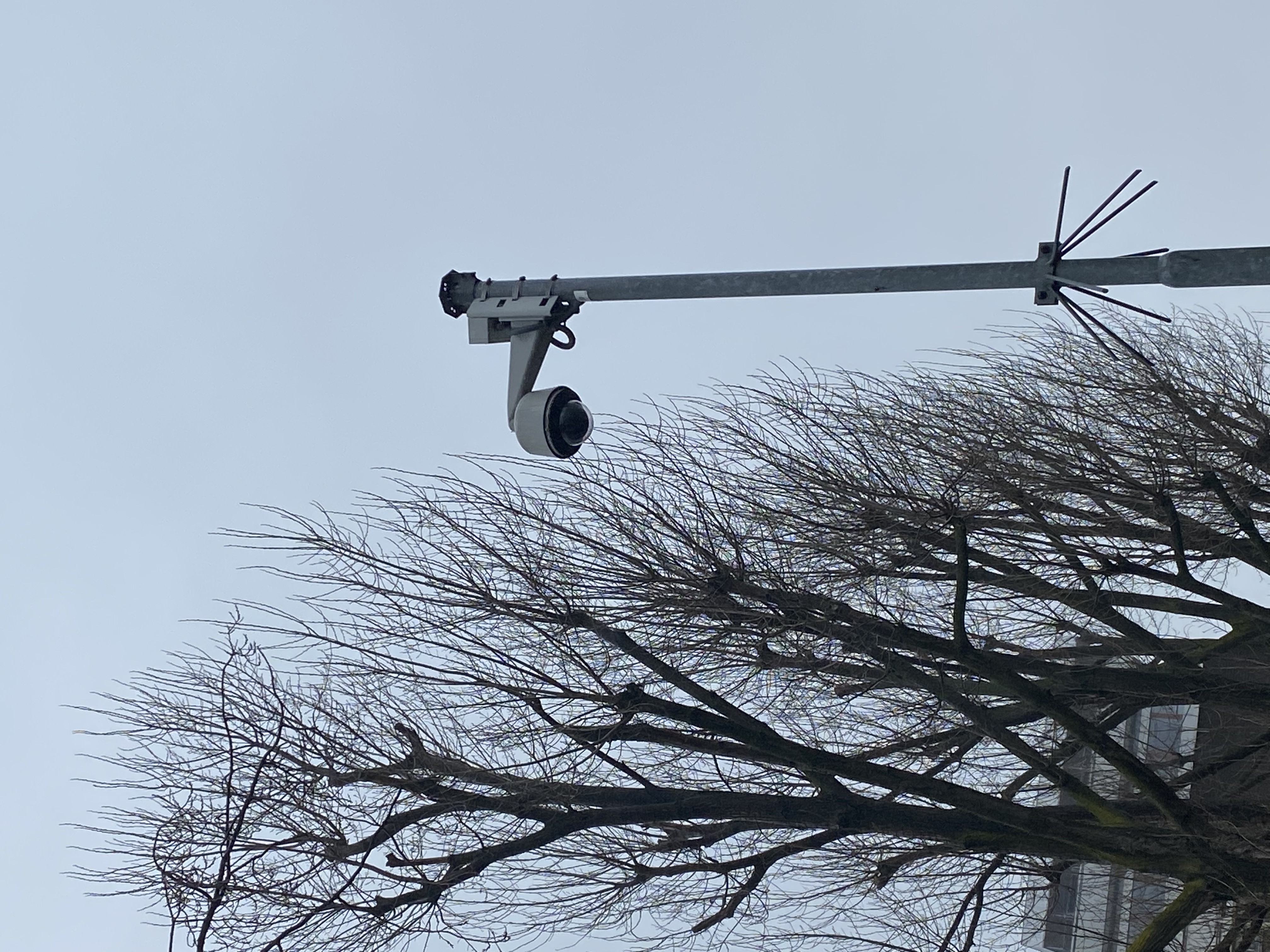
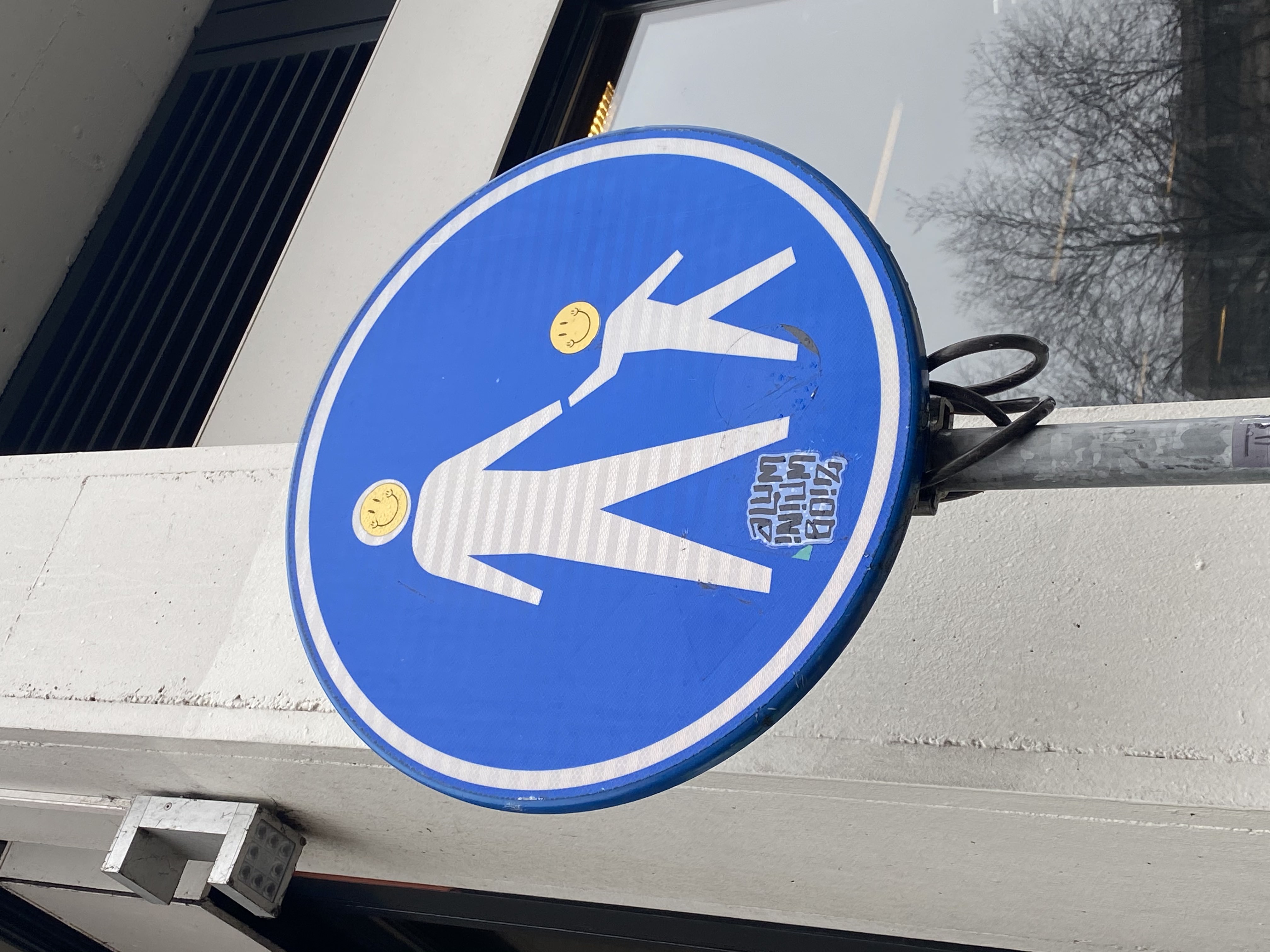
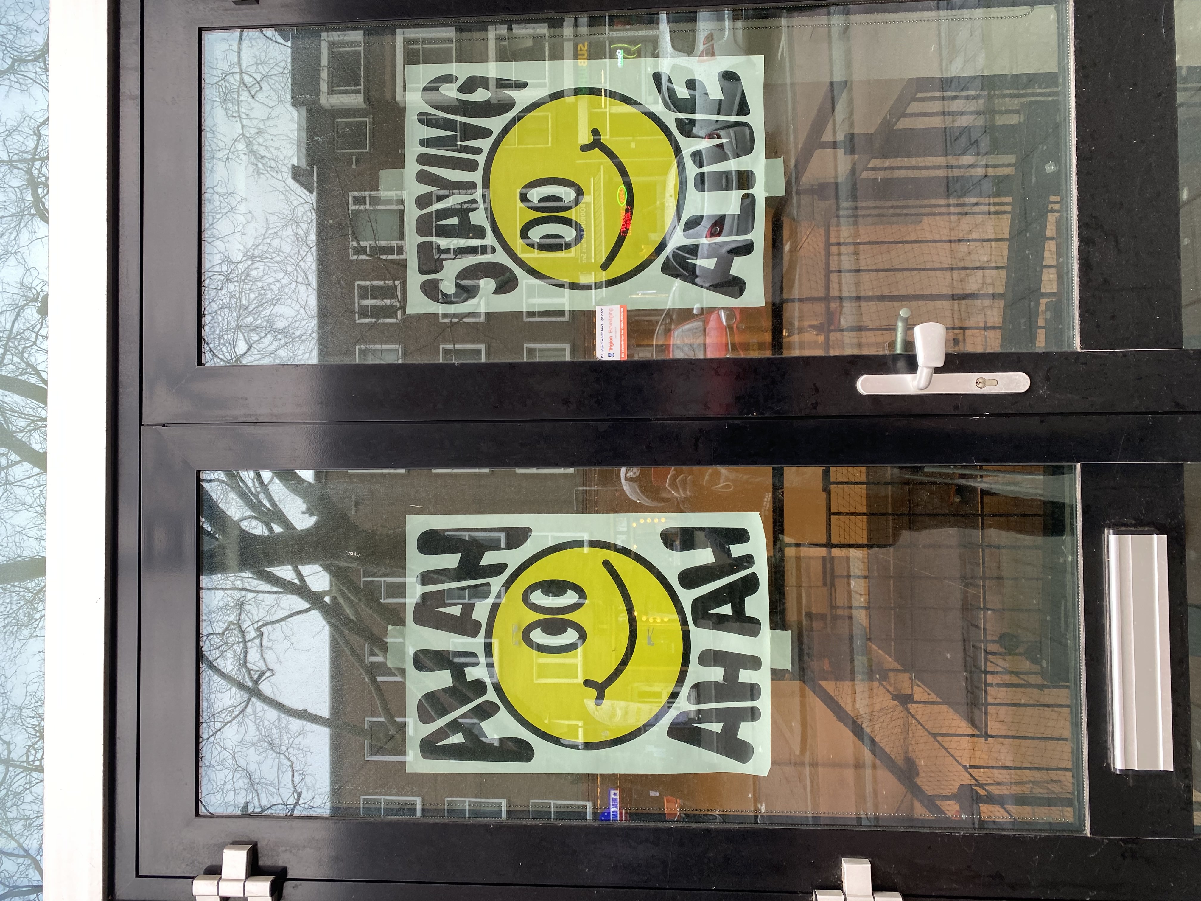
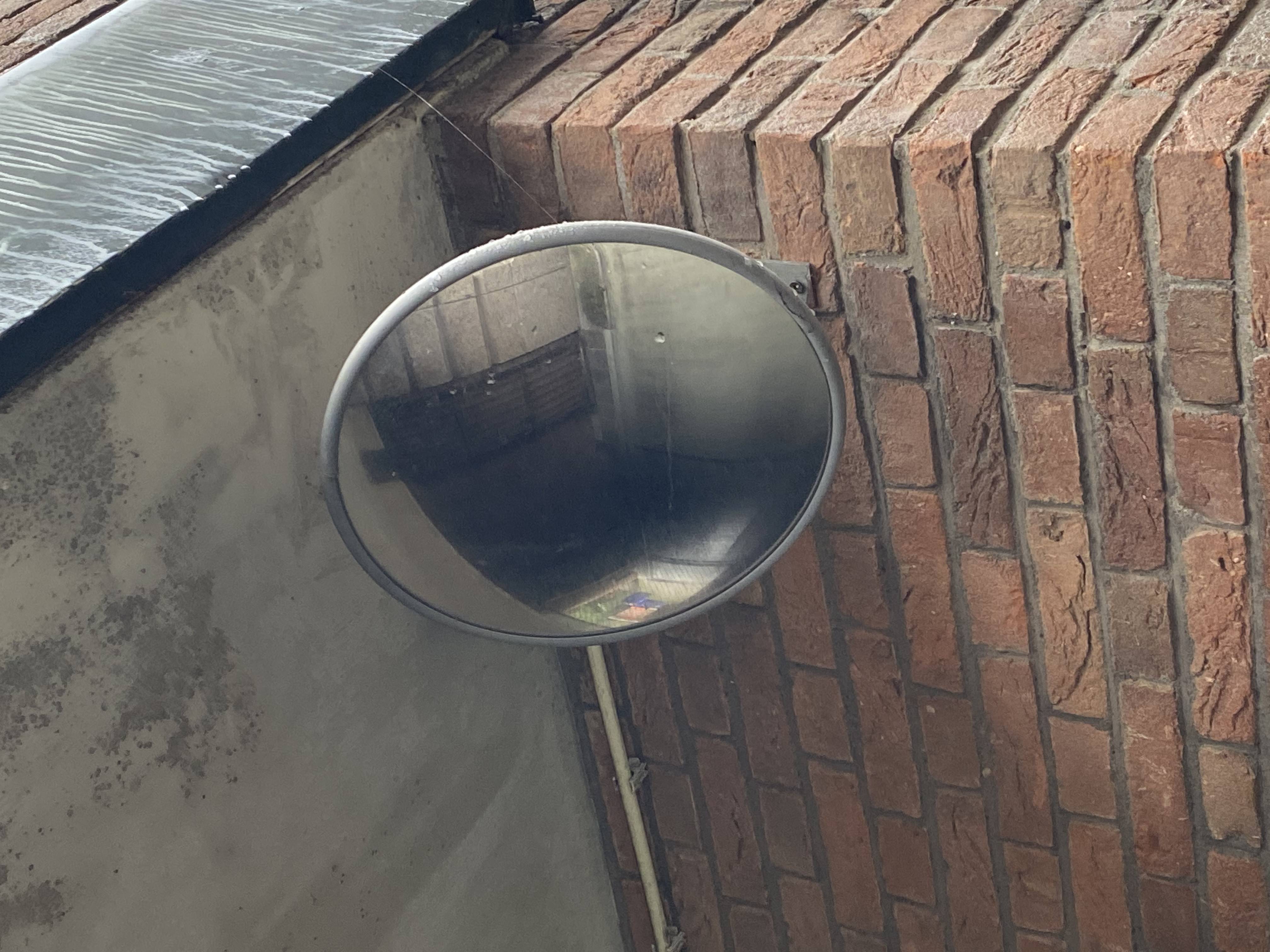
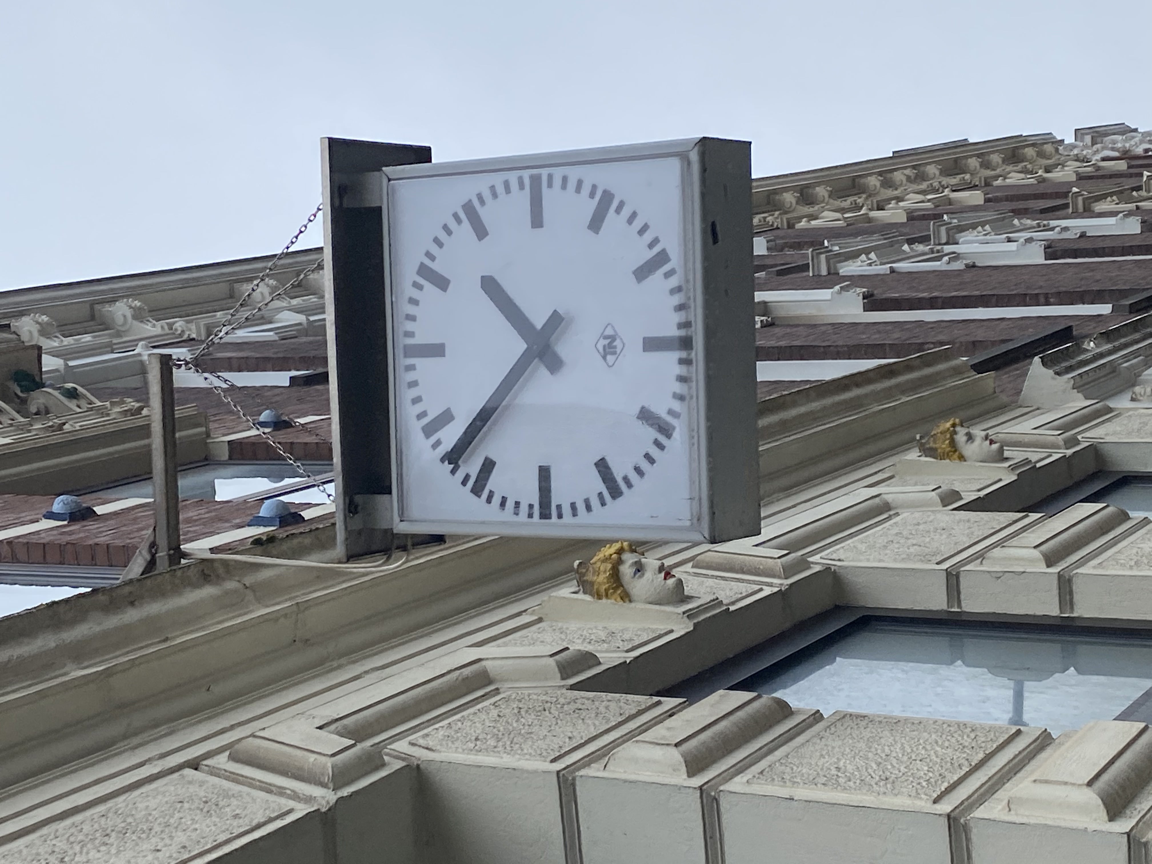
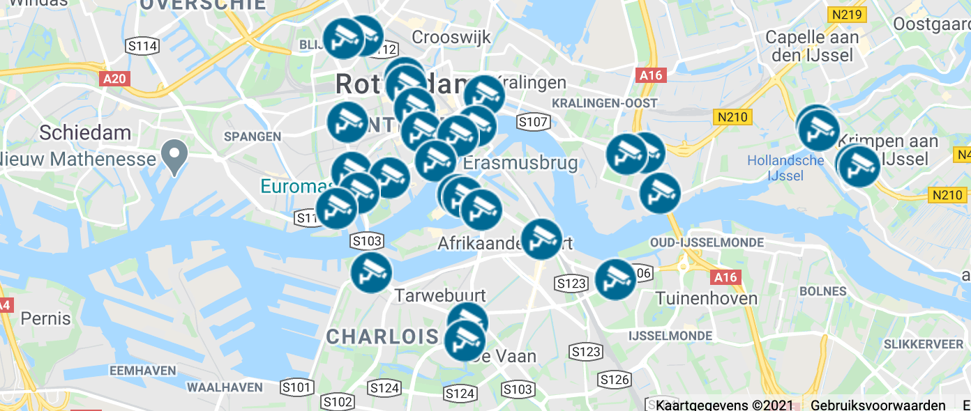
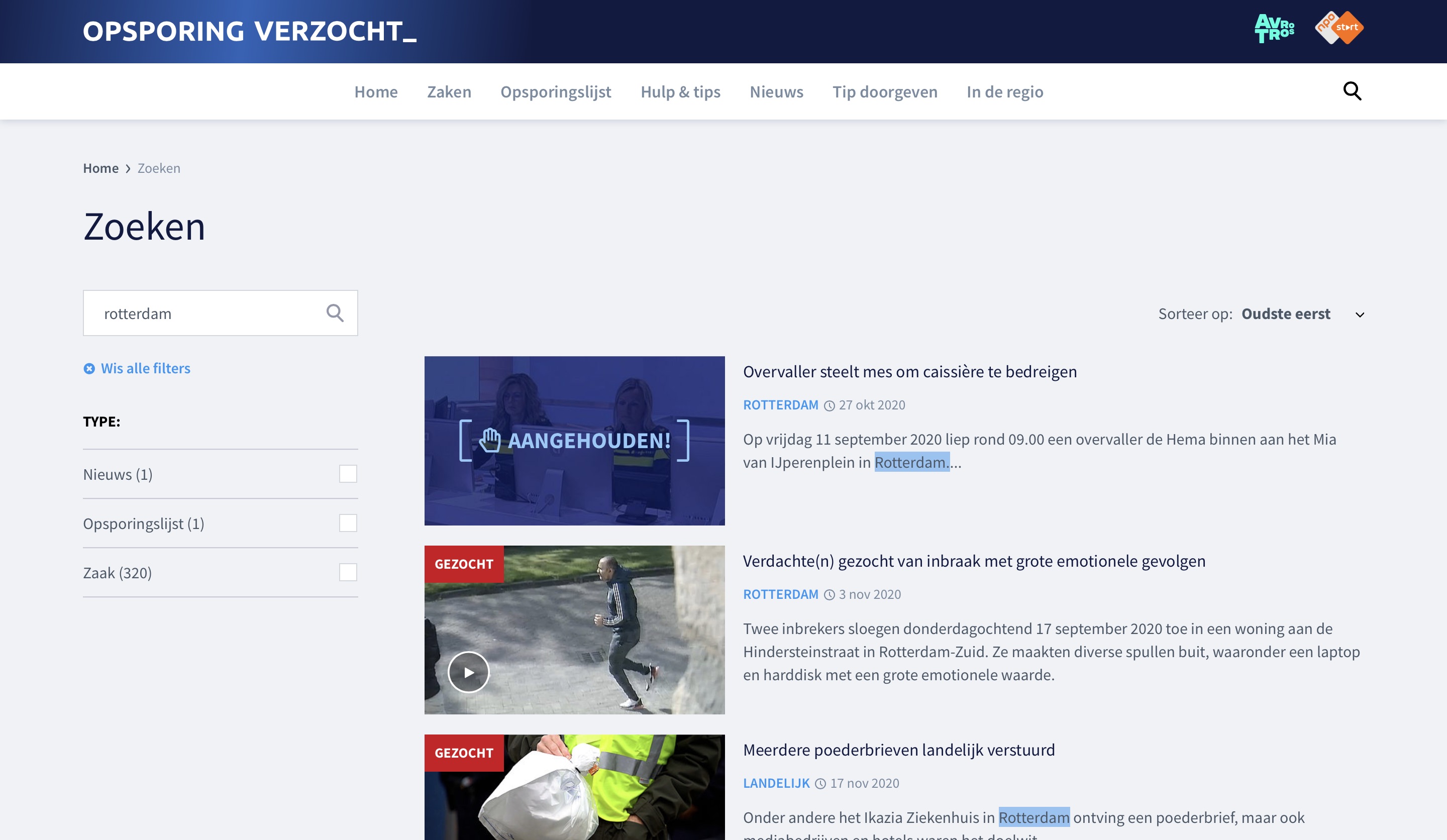
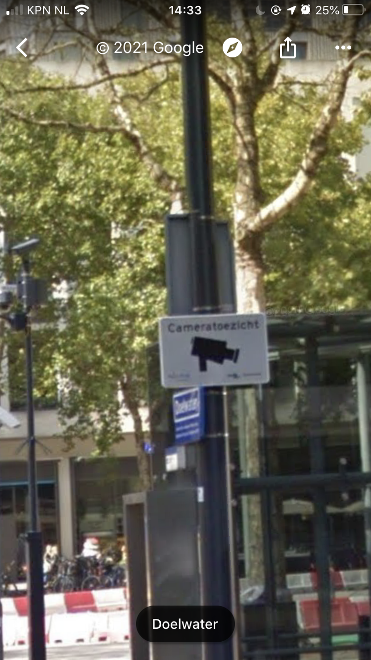
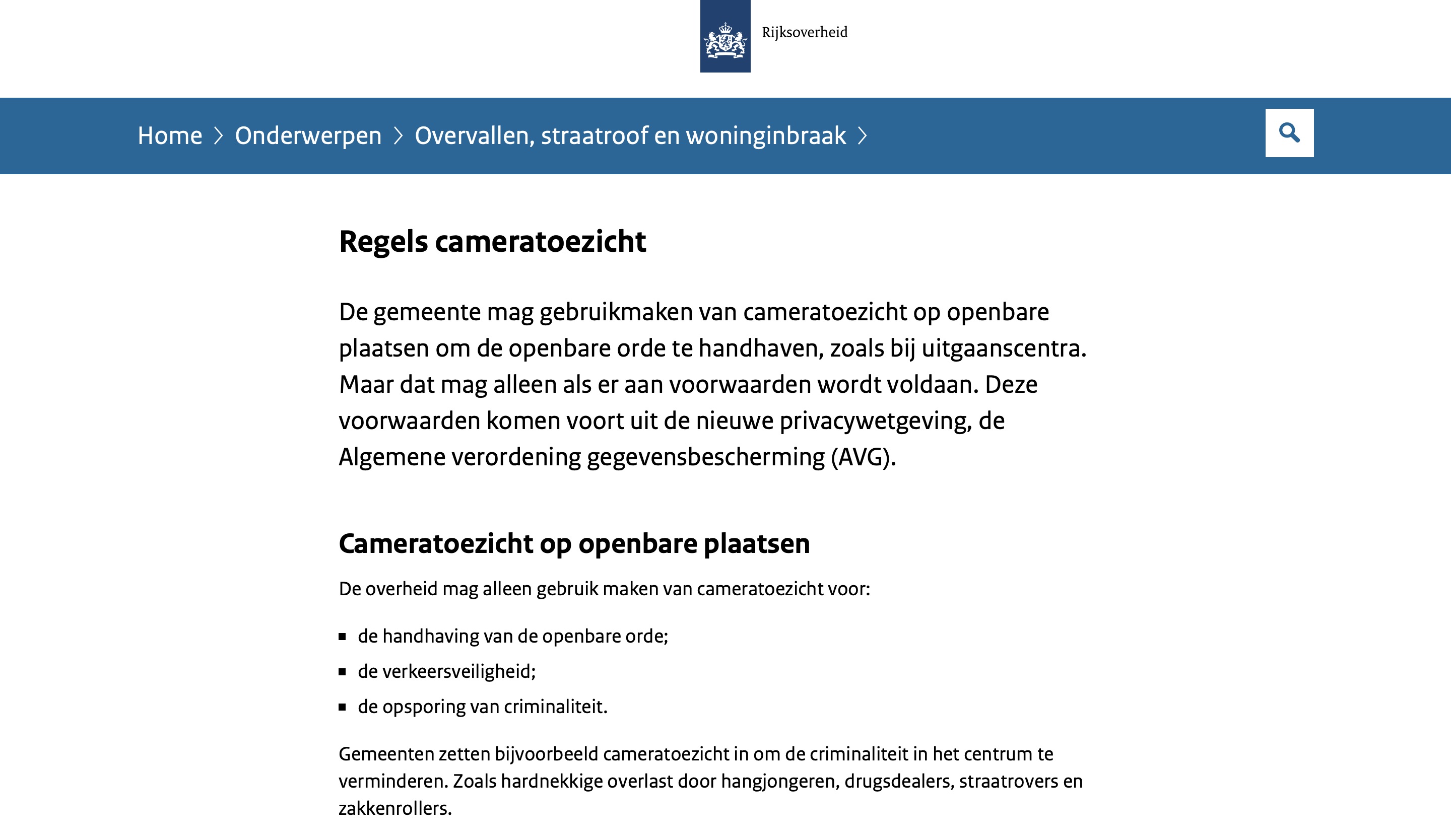
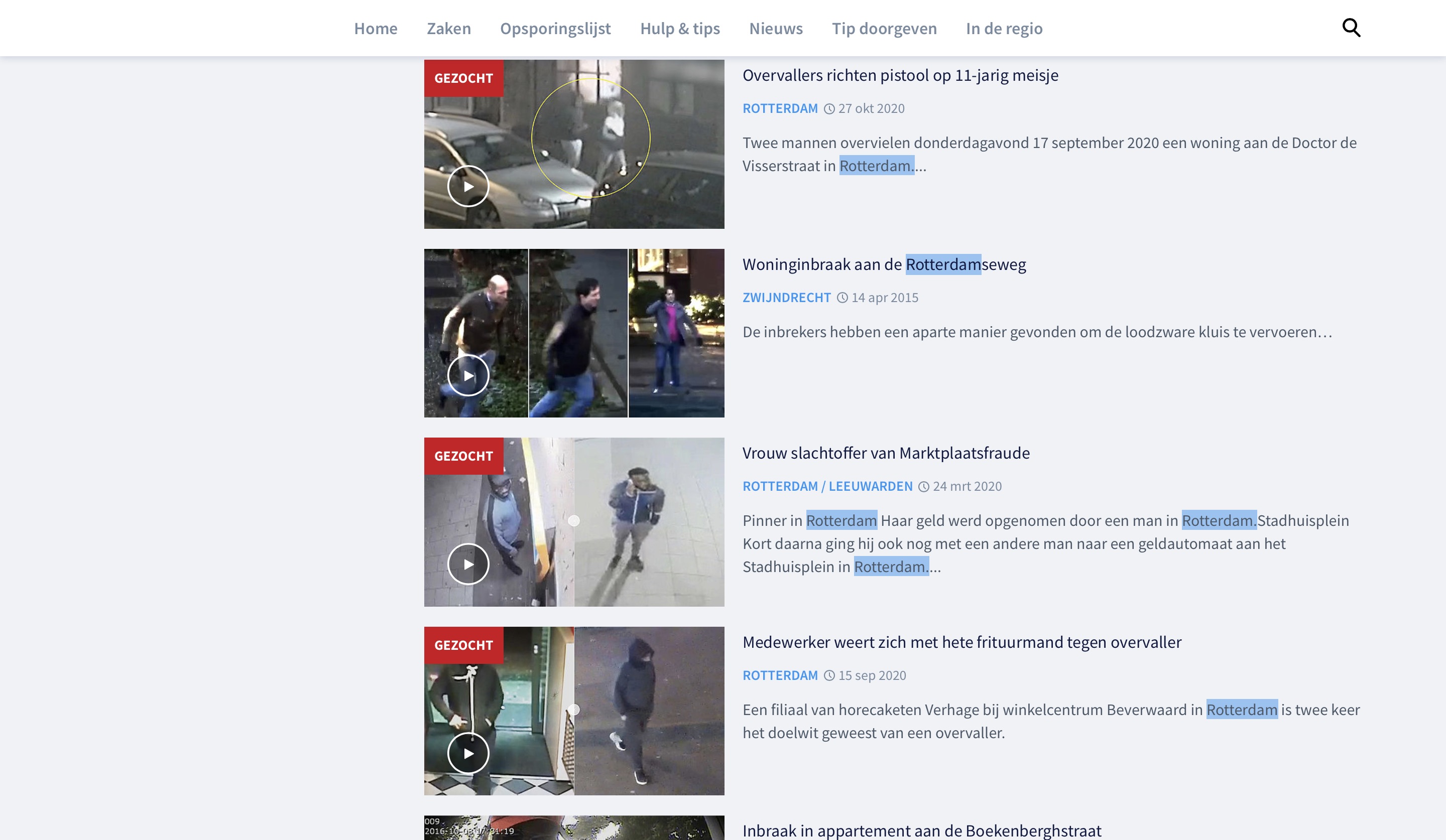

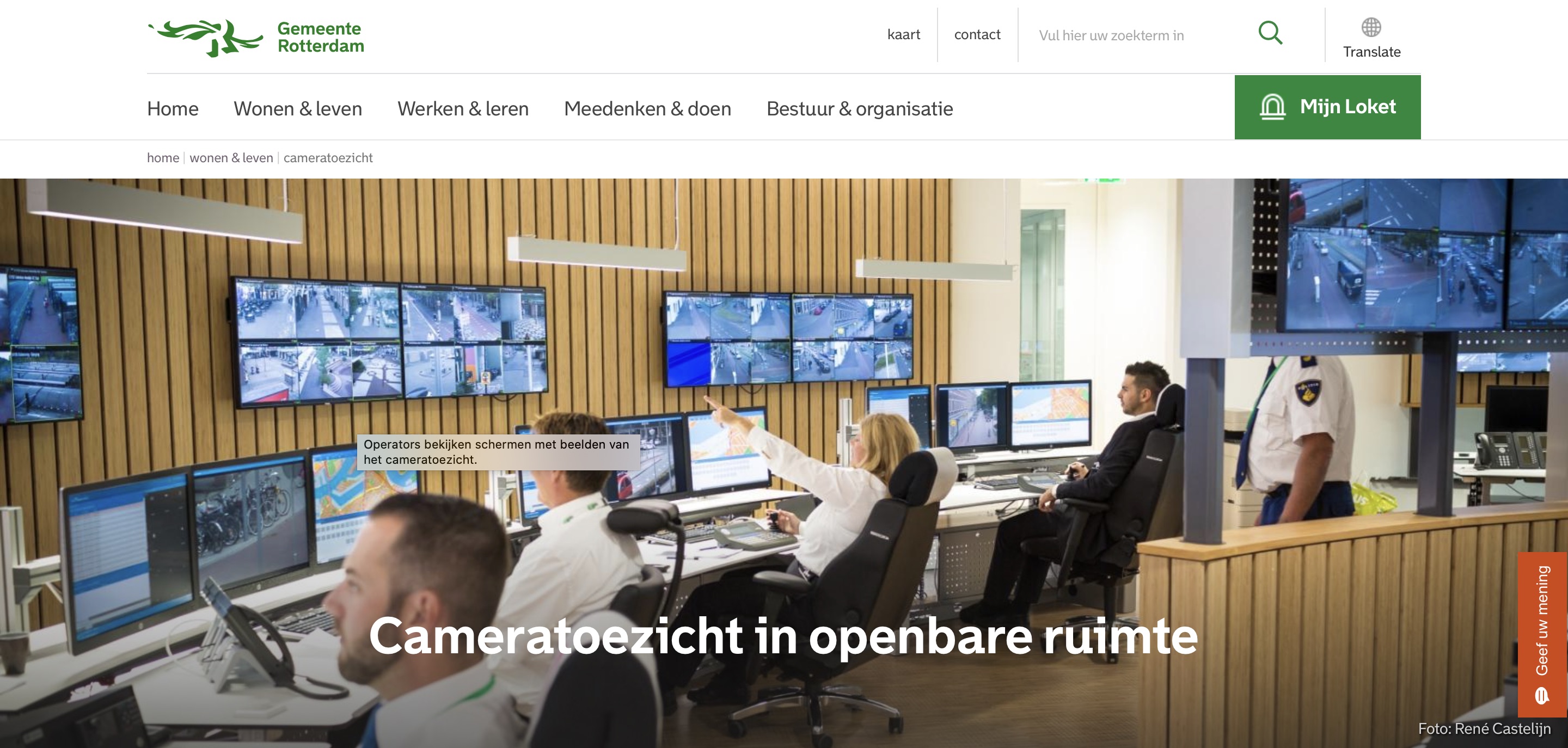
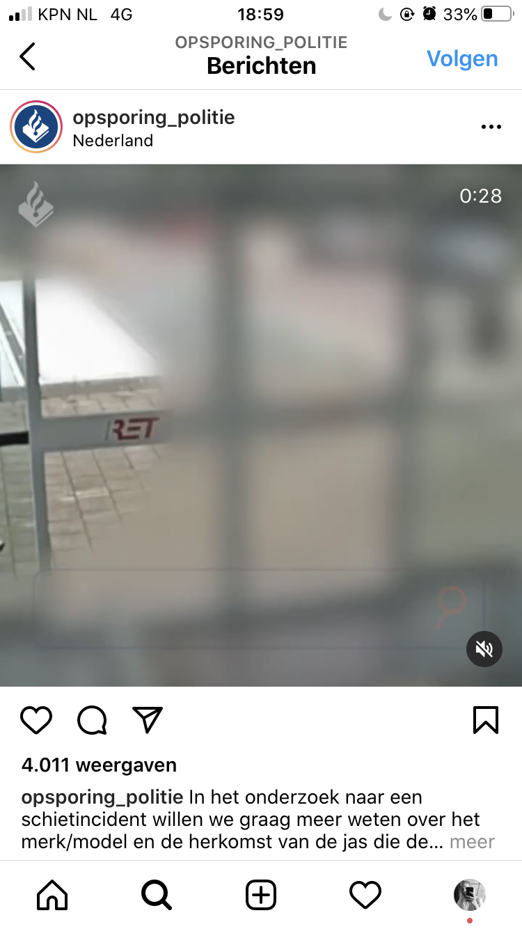
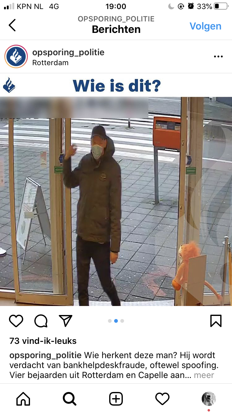
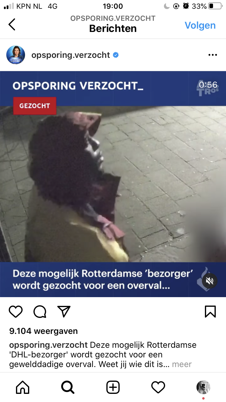
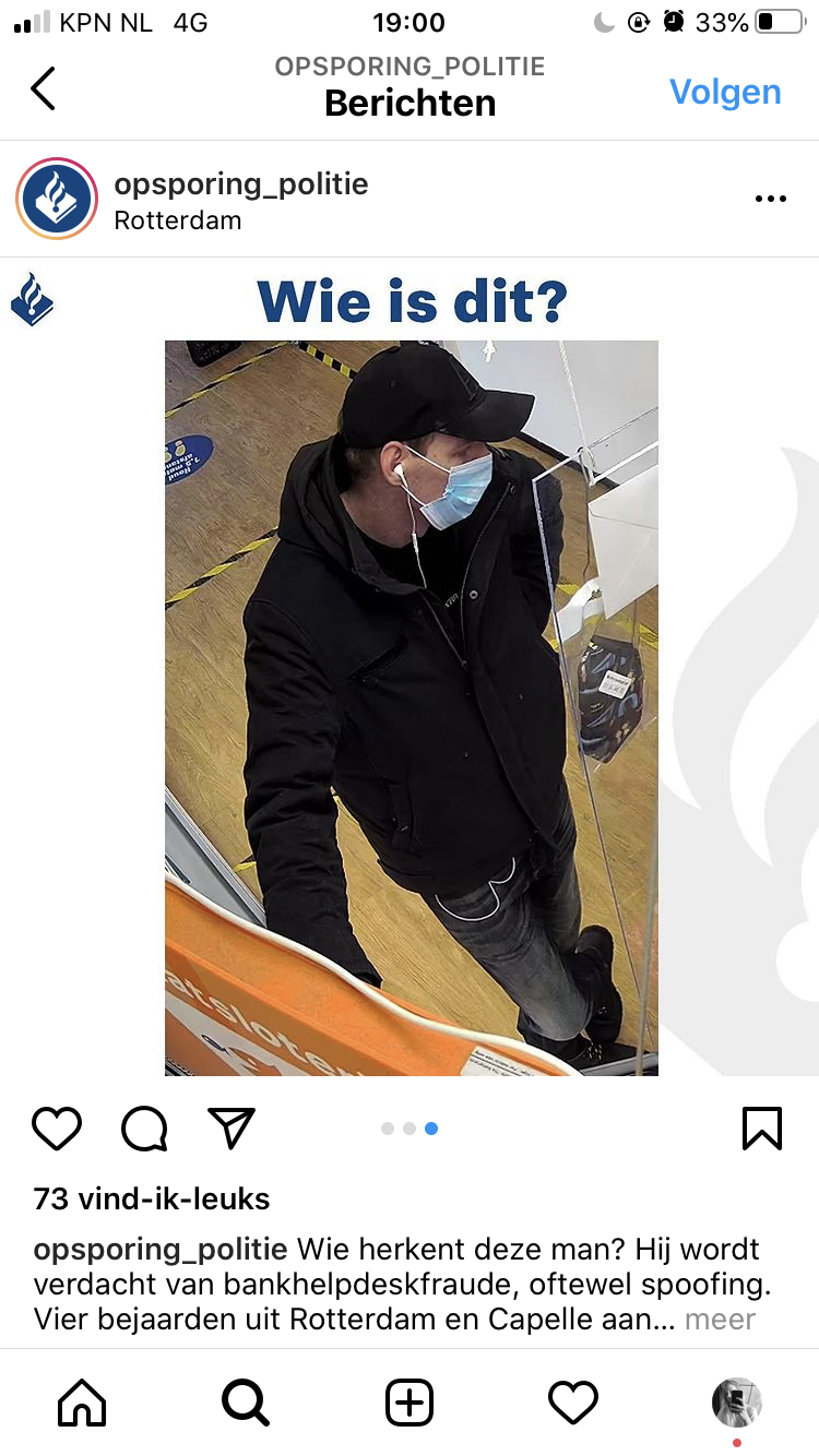
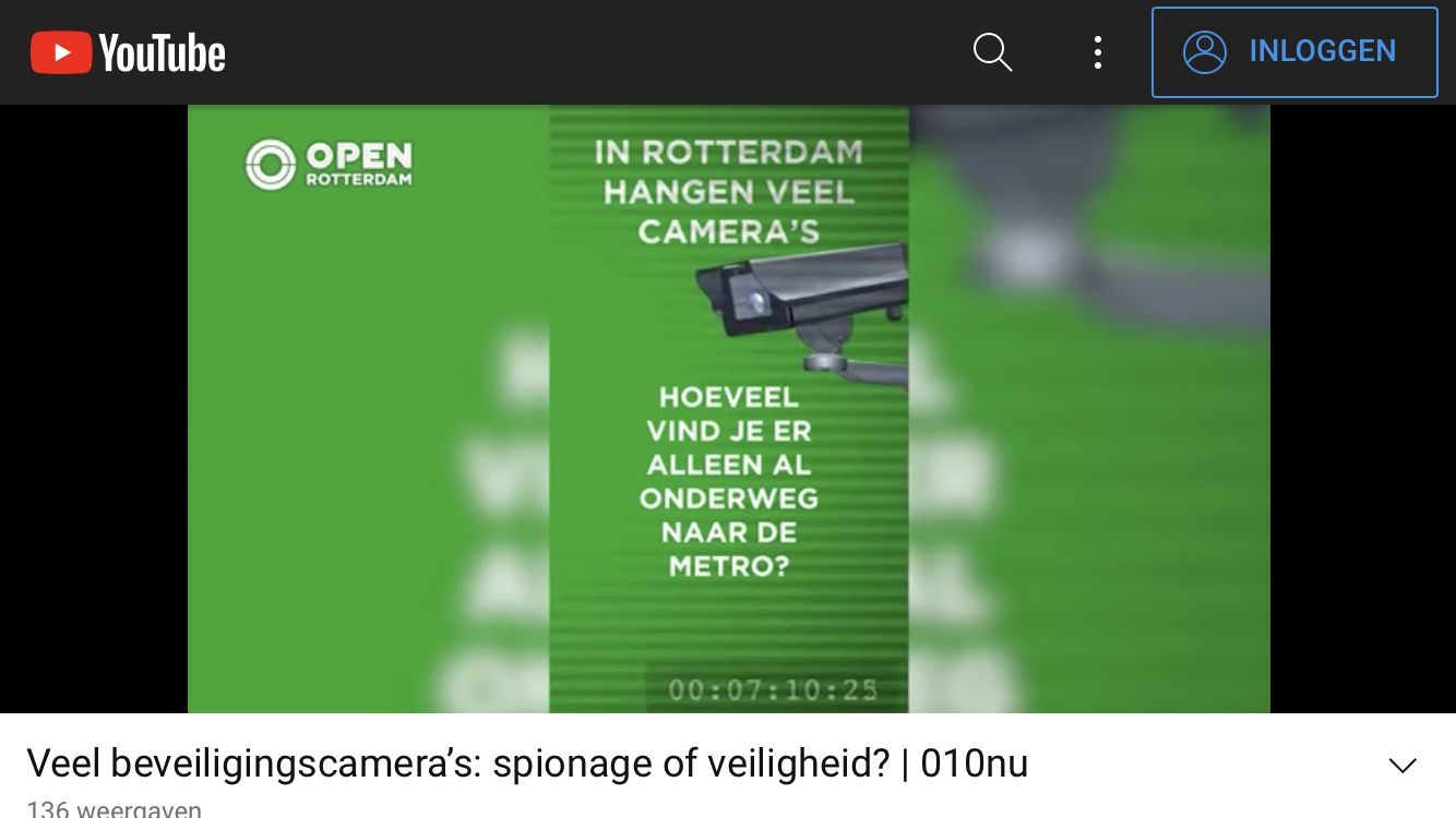
During our derive we noticed that there are many security cameras in Rotterdam. We found this interesting topic and started to delve further into it during our digital derive. We figured out where most of the cameras are and tried to come up with a concept. Despite the fact that we thought it was an interesting subject, we got stuck. We didn't really know how to design a tool with the information we collected. We decided to look back at the photos we took during our derive in Rotterdam. We thought about the things we saw and topics we discussed during our walk. We arrived at two topics. This was nature in the city and homeless people. The increase in homeless people is something that is currently also in the news a lot, so we decided to continue with this. We had no ideas about the tool yet, so we decided to learn more about it first. on Tuesday we prepared ourselves for the interview we had on Wednesday with an employee of Centraal Onthaal Rotterdam. Centraal Onthaal is a central counter of the municipality of Rotterdam. Homeless people can register here and receive further assistance.
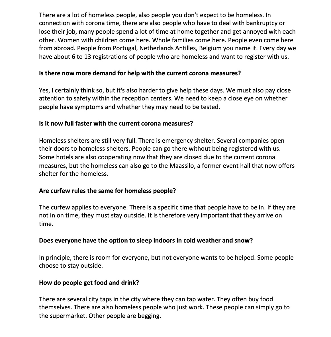
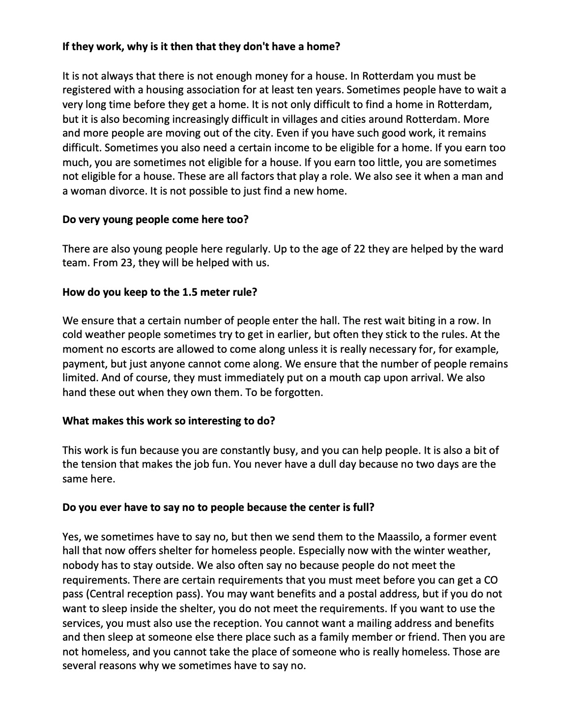
after this conversation we thought about the tool. We wanted to let people get to know the city from the eyes of a homeless person and to create more awareness about the way they live. We decided to make an app where you can search for different locations in Rotterdam with the help of the app. Once you arrive you will see a fact, interview or audio story. This can be a story of a homeless person, but also of people working in the homeless shelters. In this way we hope to create more awareness about the situation of homeless people in Rotterdam. Especially in the current corona period where there is often not enough space in the homeless centers. we also want to help the homeless and therefore add a donation box to the app. You can choose whether you want to donate and how much.
we tested the app by sending it to others and asking for feedback.
Feedback
- make the dots bigger because it is difficult to tap them
- the cups folder, donate, info veer veins. Place information at the top and donate at the bottom that makes the order more logical.
- More space between the texts so that the texts are clearer
- wording some sentences differently
link of our prototype:
https://xd.adobe.com/view/9dc5ee37-0352-4123-a06b-a9b932231fe4-c896/
If we could develop the app further, we would of course add more locations. We would add more personal stories. Stories and memories of homeless or old-homeless people that are specifically linked to a particular location. So that you as an app user can really put yourself in someone else's place and gain empathy for the situation in which people live. We want to make it clear that there are very different situations and that everyone could become homeless. sometimes it is a choice, but very often its is not.